IQONIC
Creative Process & Branding Concept
Creative Process & Branding Concept
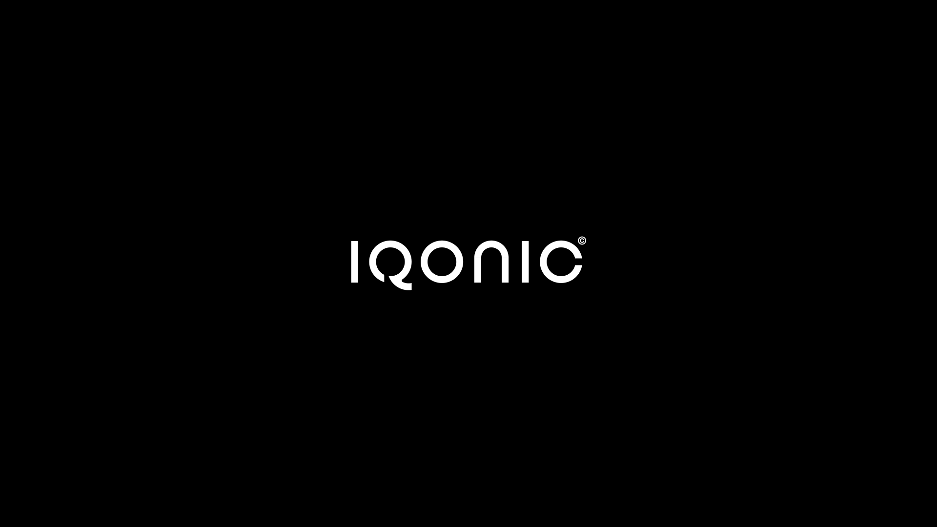
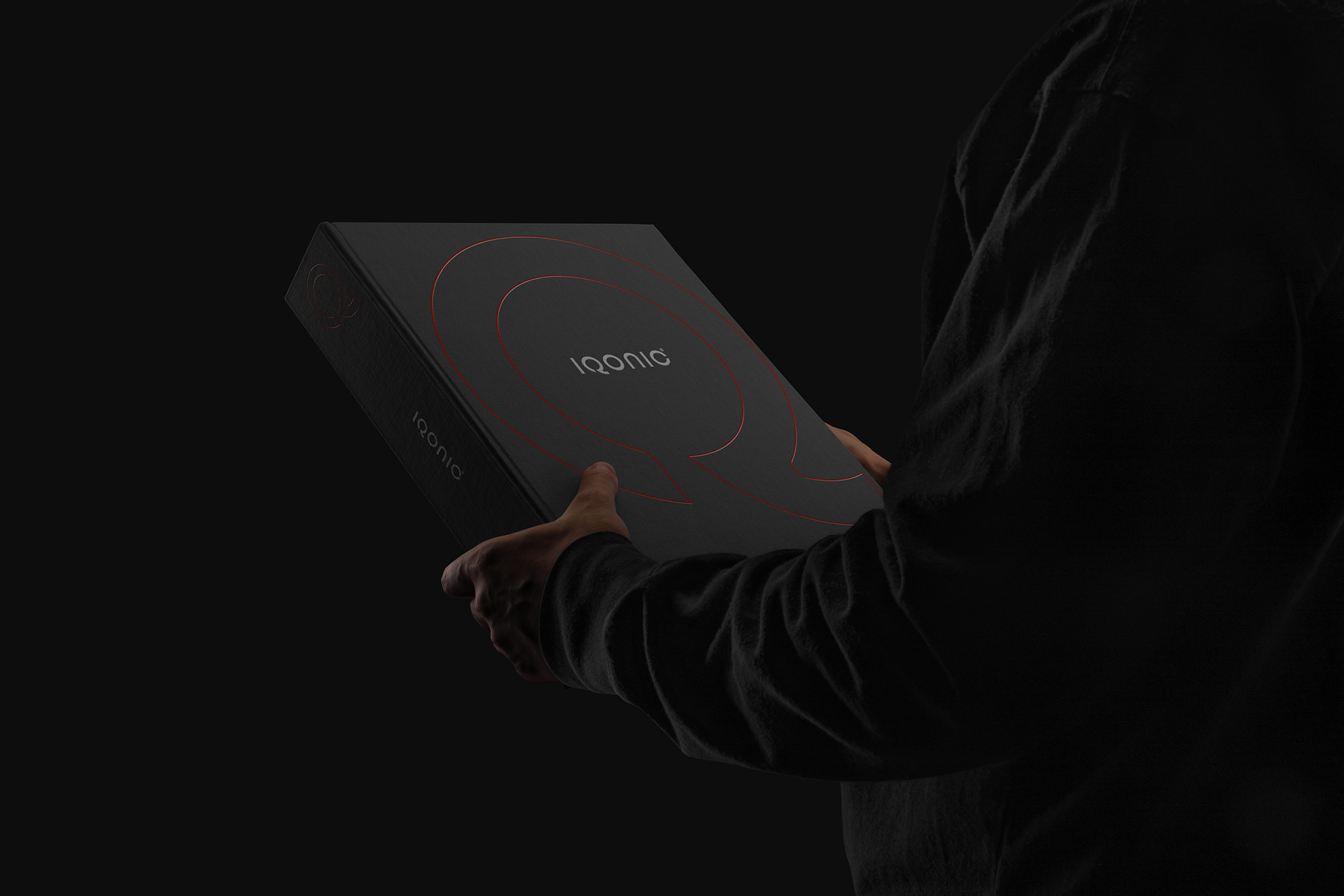
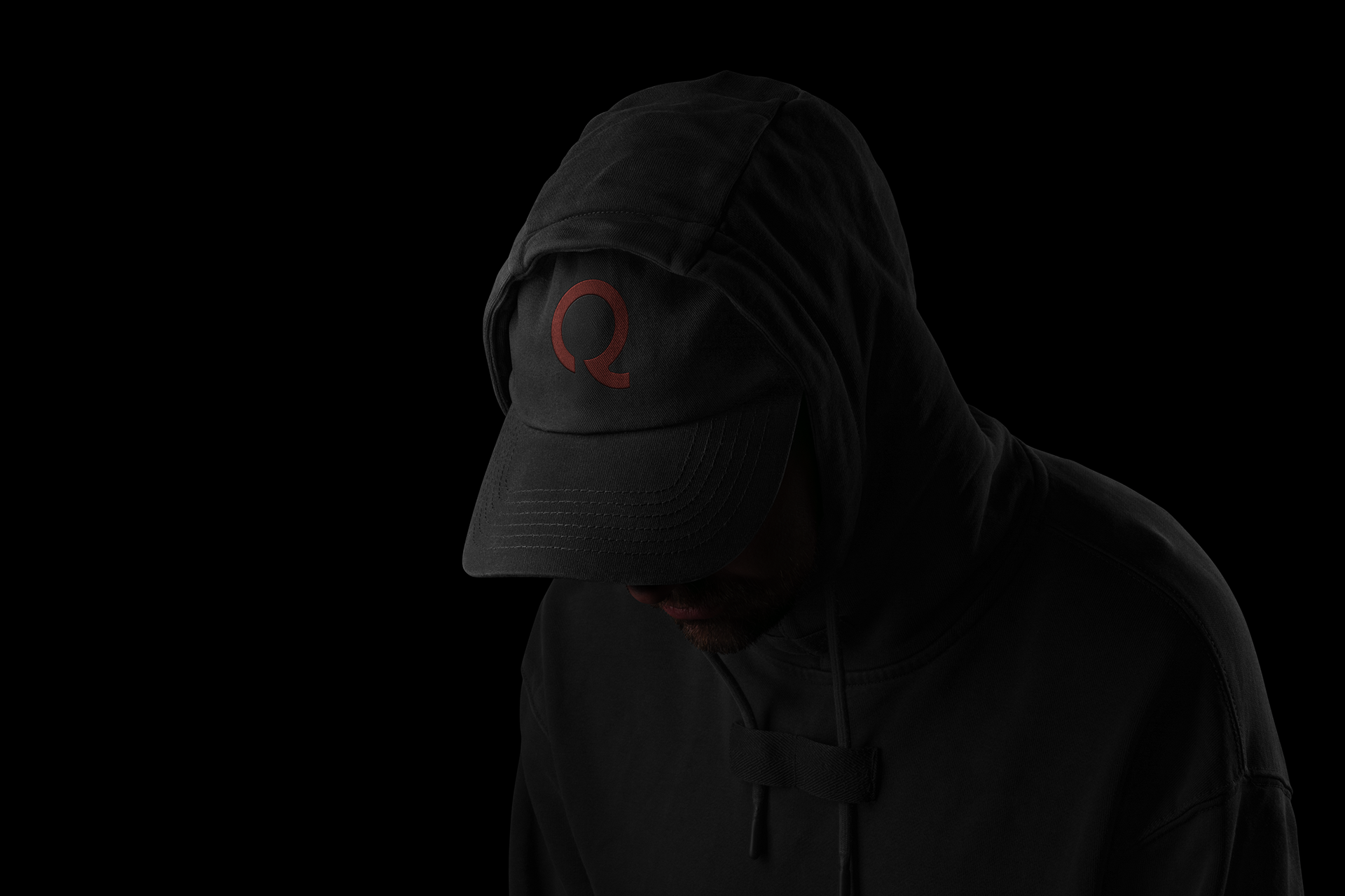
The branding project for IQONIC was conceived around a single, powerful idea: communication as identity. From the company name itself, the letter Q became the central element of the logo design. Due to its distinctive shape, it provided the perfect opportunity to evolve beyond typography into a speech balloon, a universal symbol of communication, exchange, and interaction.
This conceptual bond visually represents IQONIC’s role as a connector, where ideas, technology, and people communicate seamlessly.
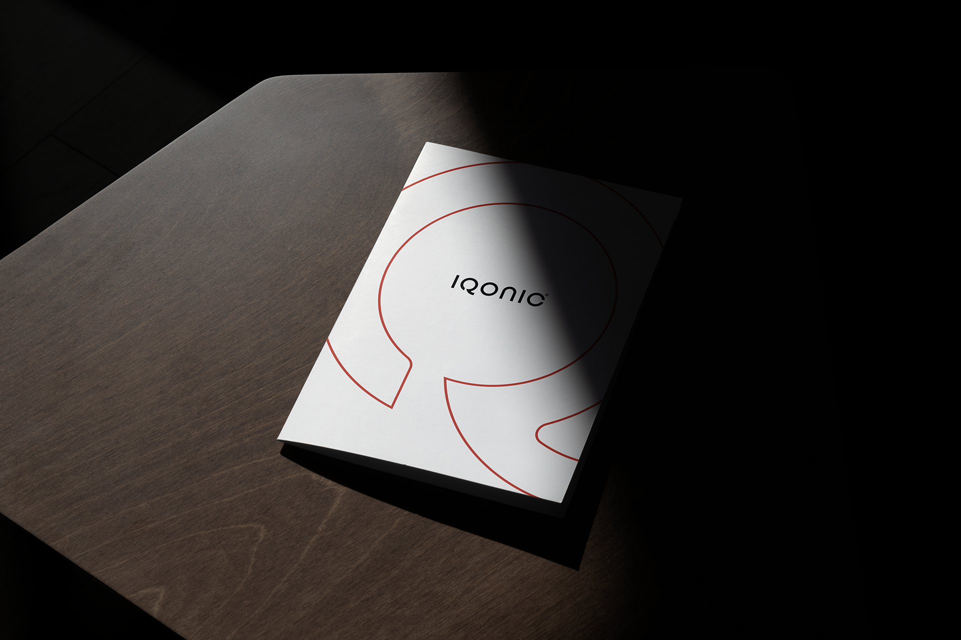
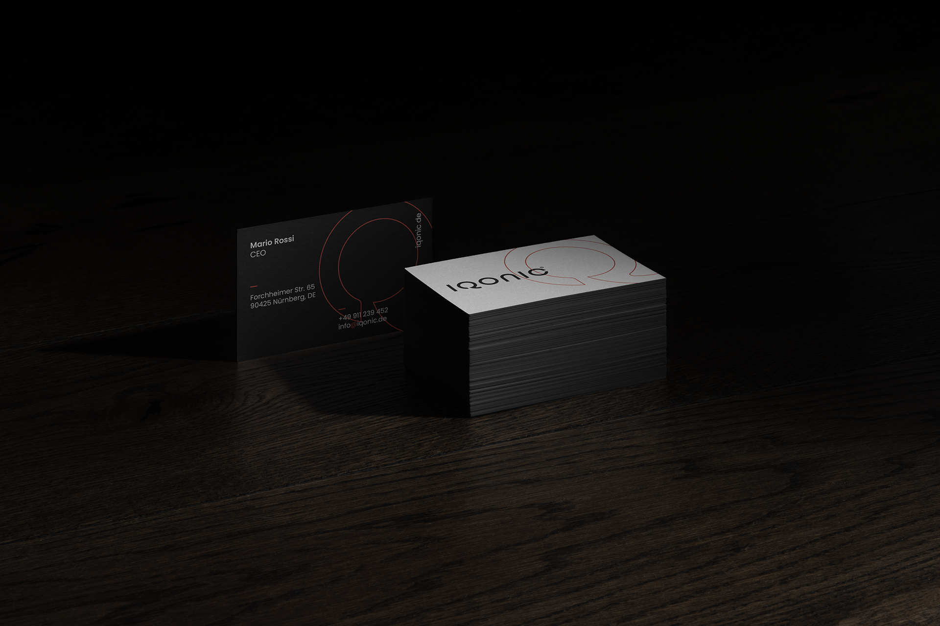
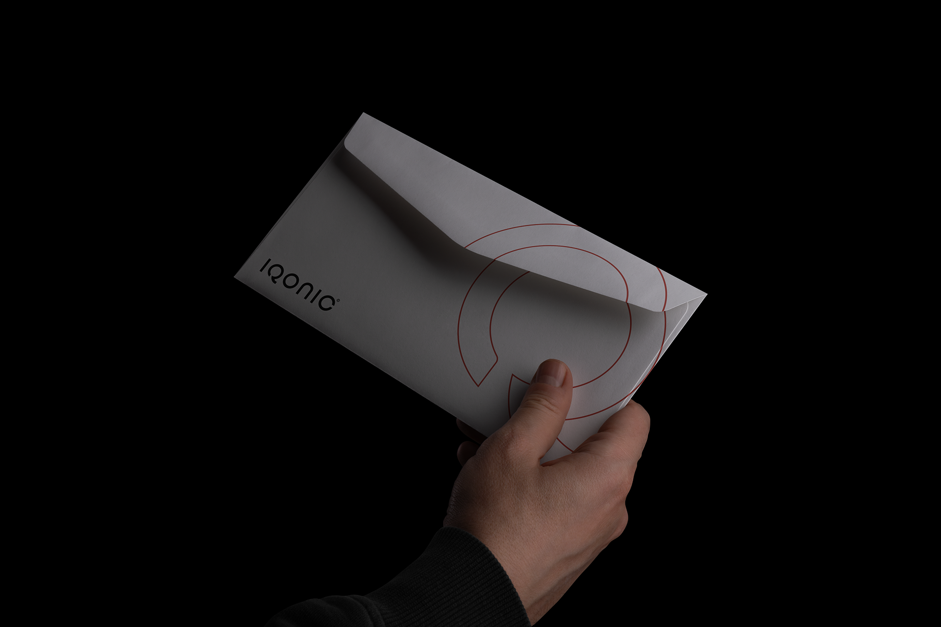
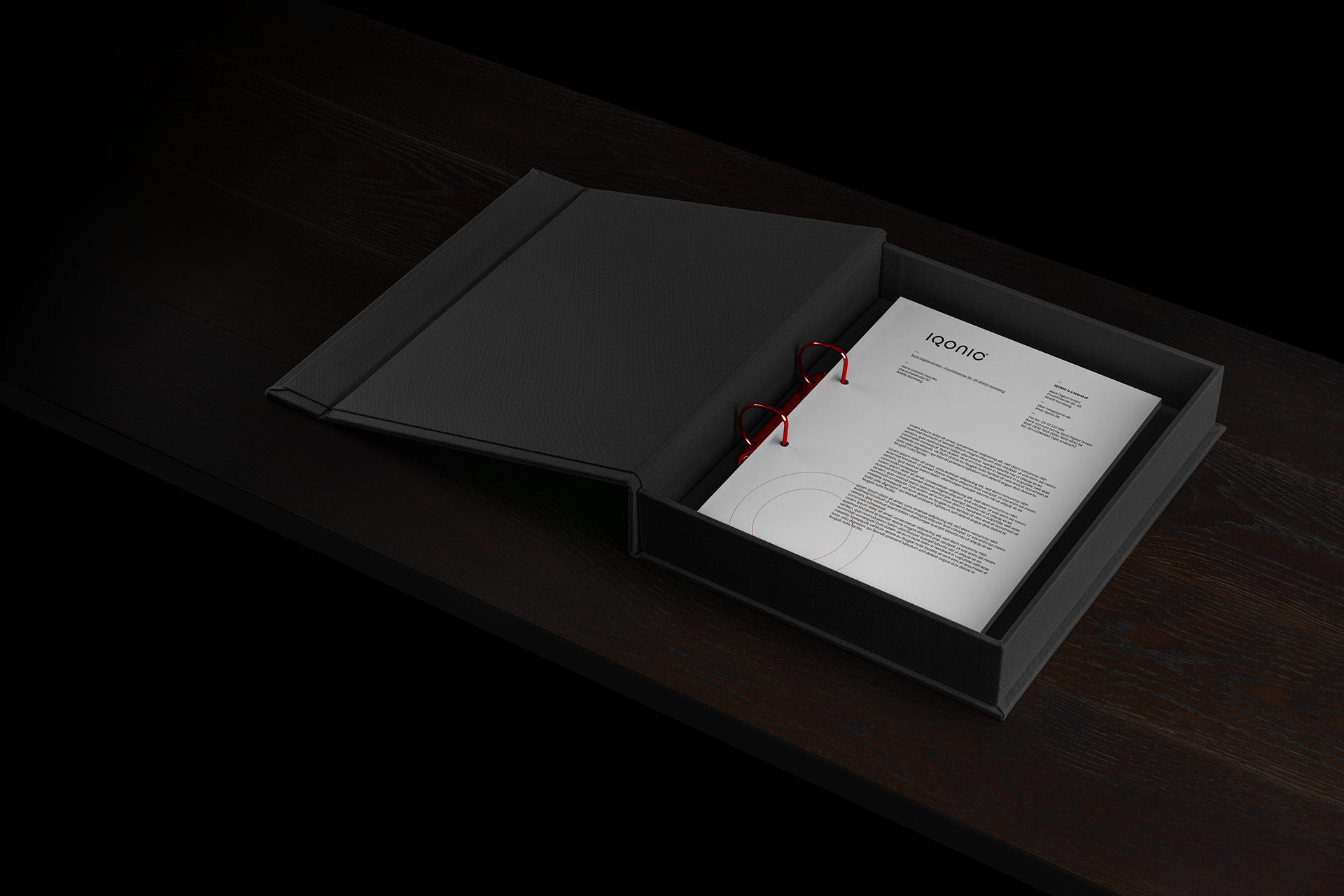
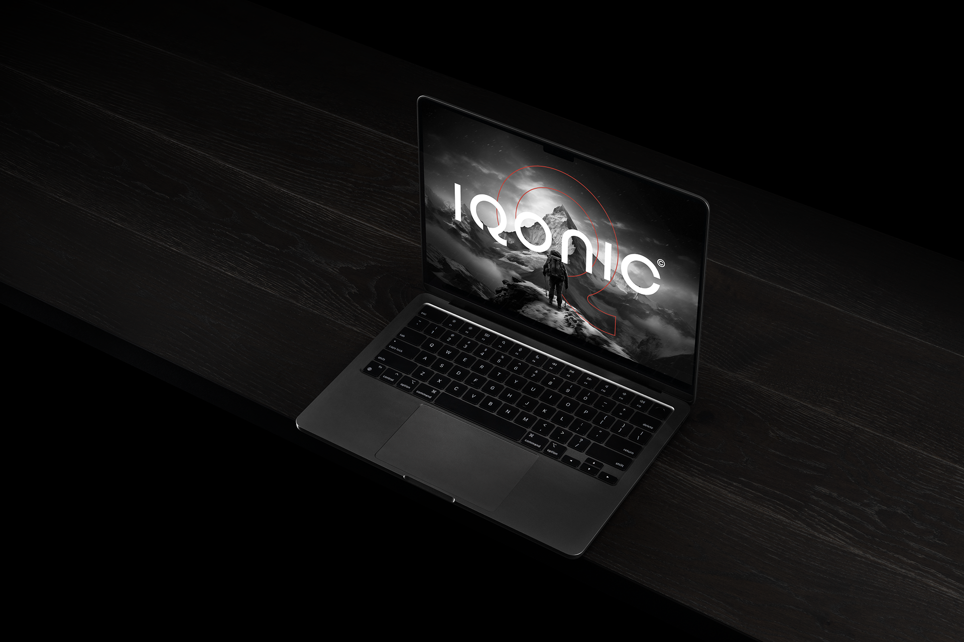
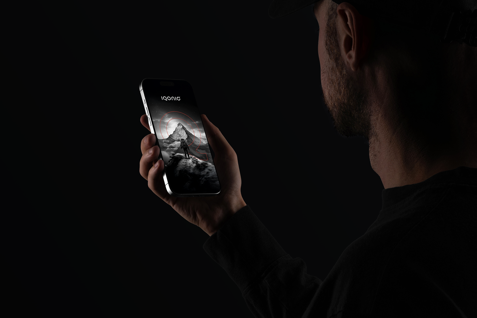
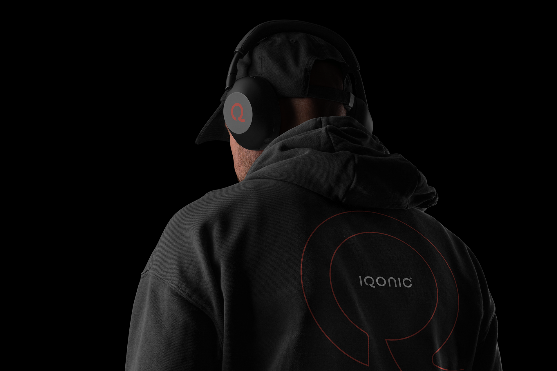
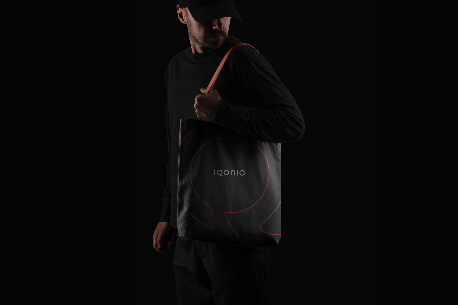
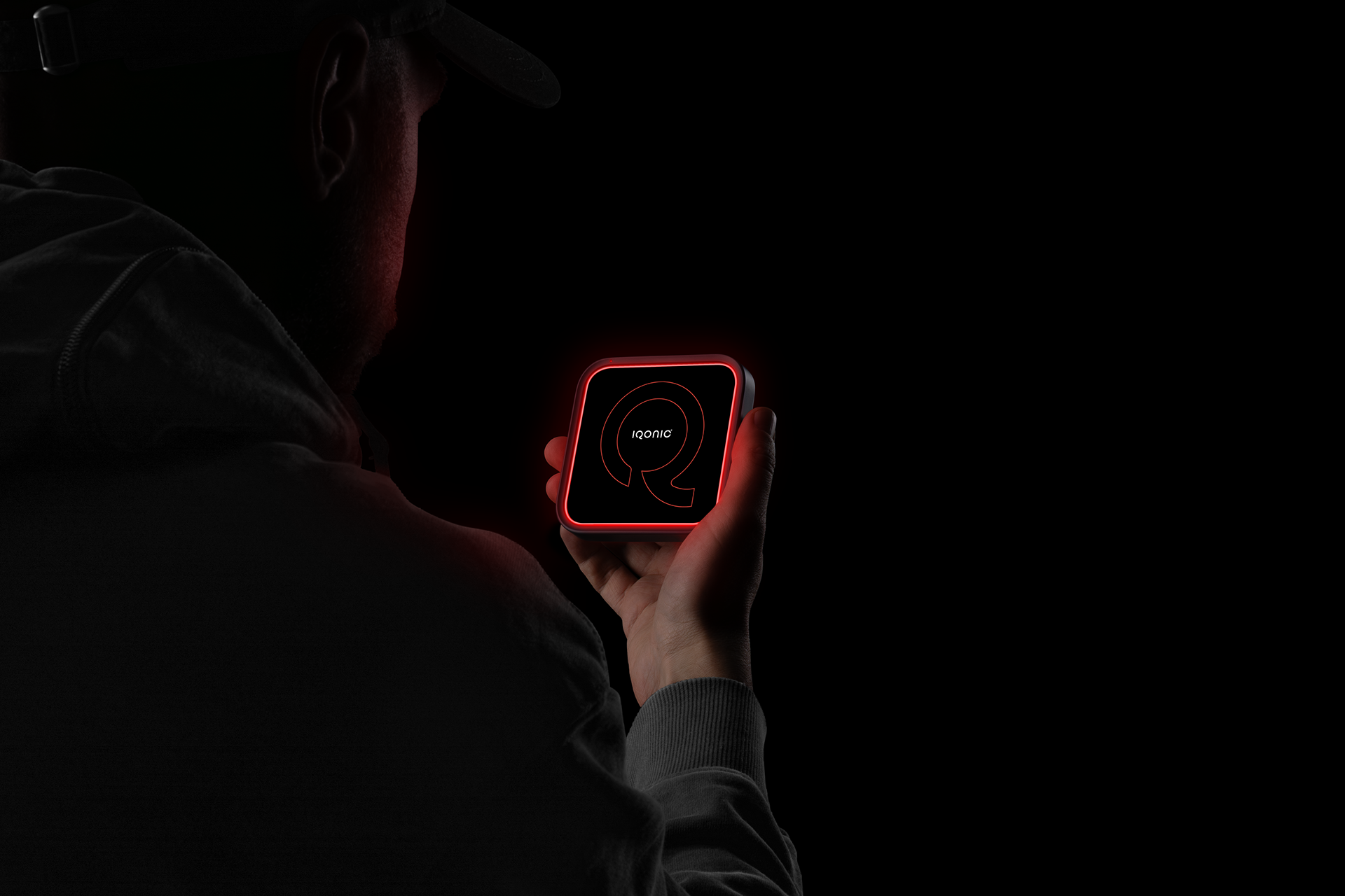
From a brand identity perspective, the logo balances clarity and character. While the speech balloon structure reinforces approachability and openness, the refined geometry of the letterform provides a modern, professional feel. The visual identity system was developed to be flexible and scalable, allowing the logo to perform consistently across digital interfaces, brand applications, and corporate communication.
Every design choice, from proportions to negative space, was guided by usability, recognizability, and long-term brand coherence.
This results in a visual identity that is not only iconic, but also functional-designed to suggest ideas clearly, communicate effectively, and bolster IQONIC's market presence.
Scope
Brand Identity, Logo Design, Print Materials.
Elle Visual | Instagram | Email | Website | My Mockup