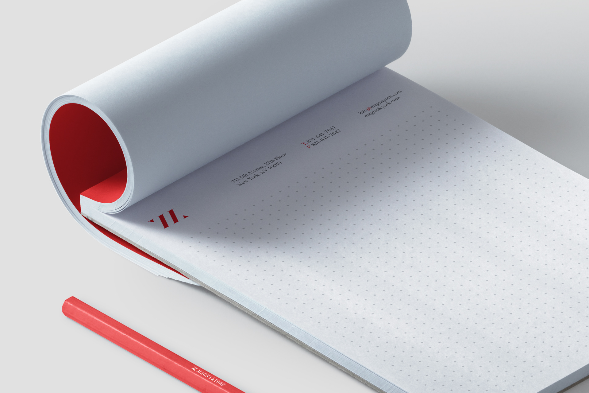
Magna & York
-
We own and lease multi-family buildings in Manhattan and we also own land and develop it as multifamily buildings in Manhattan. We run our business with the highest degree of honesty, integrity and efficiency.
I like to compare our business to a "Patek Philippe" watch. It is seamless, elegant and will stand the test of time and you can always rely on us - whether you are a market player or participant or a tenant.
—Scope:
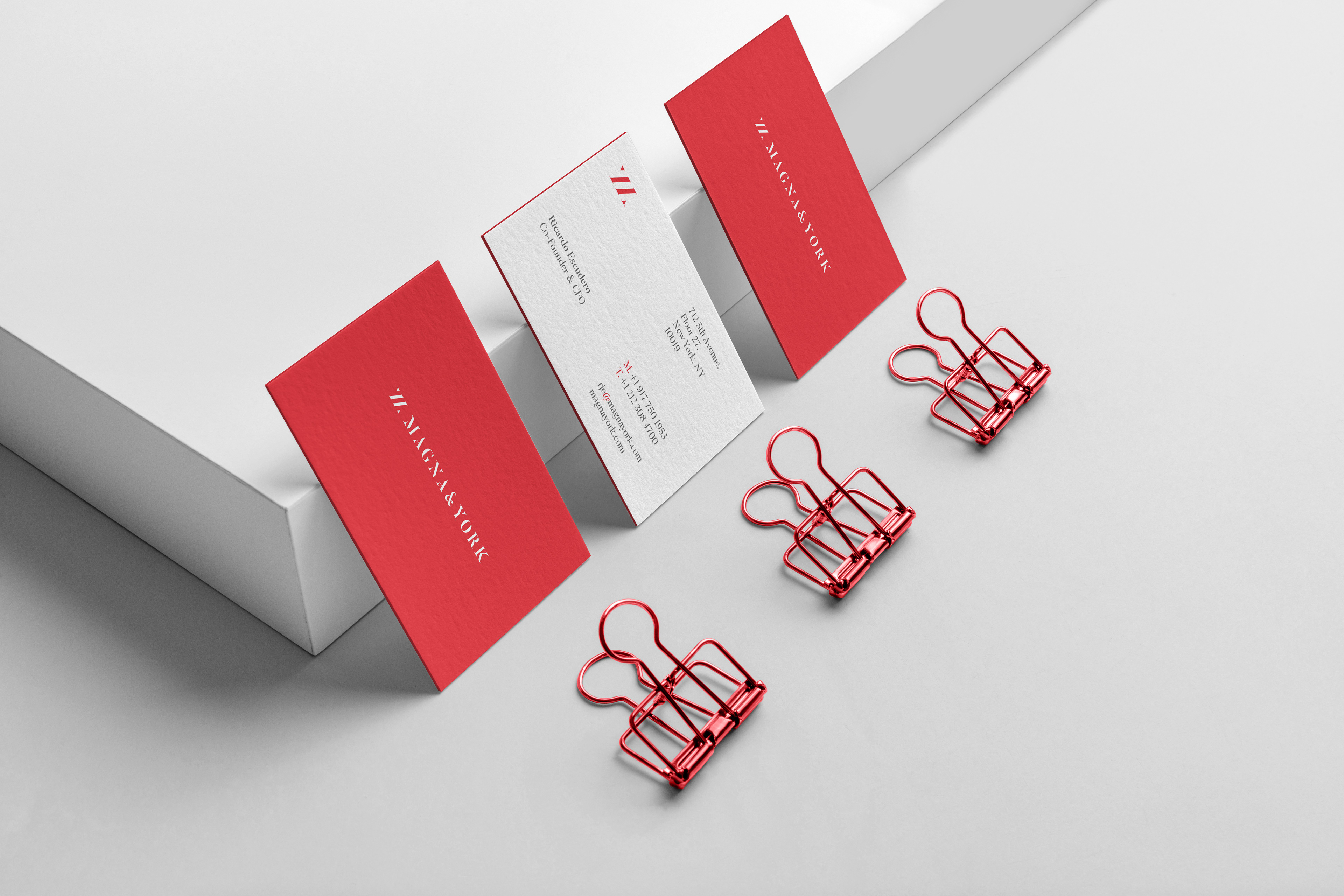
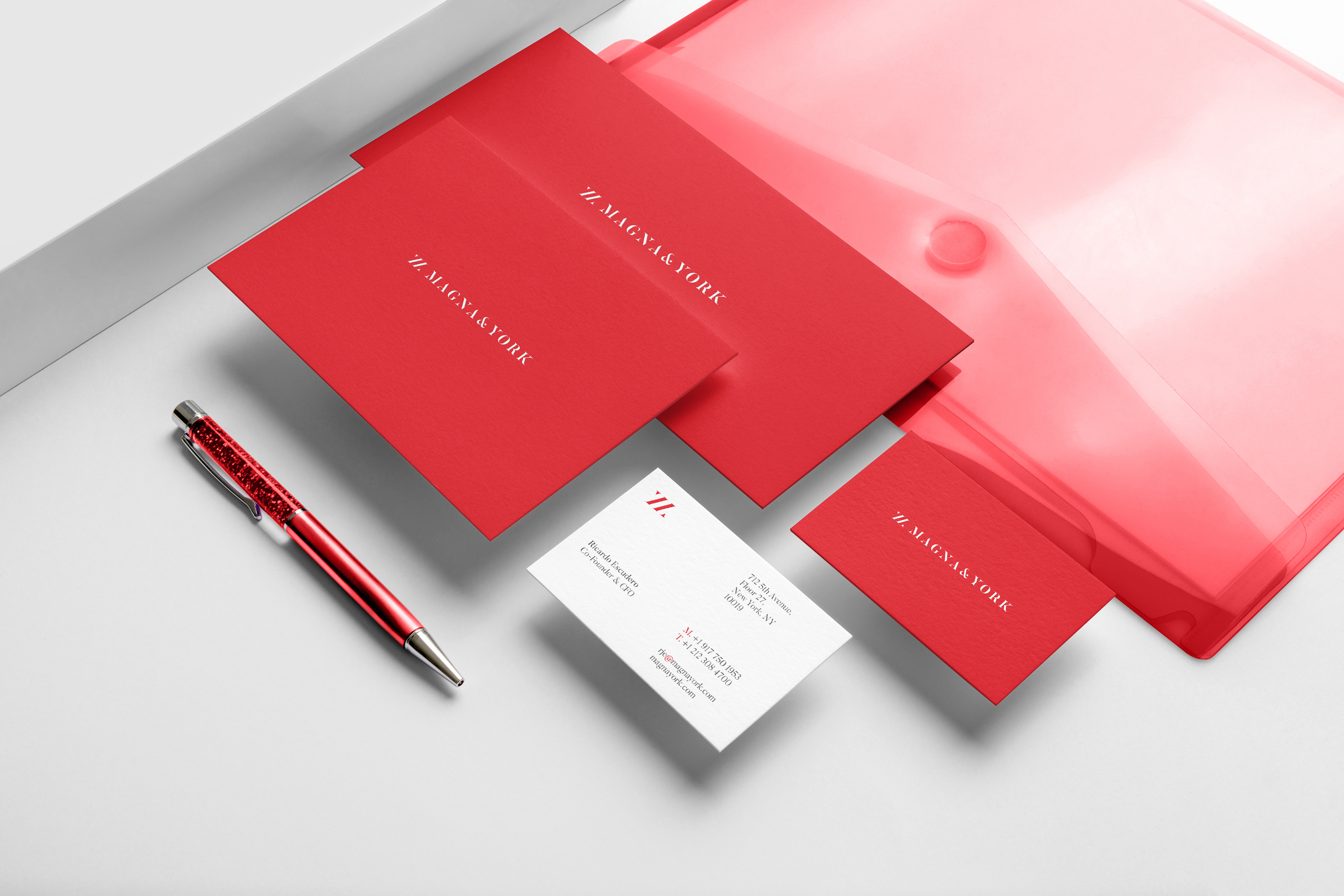
Logo Design and Branding, Print Materials.
—

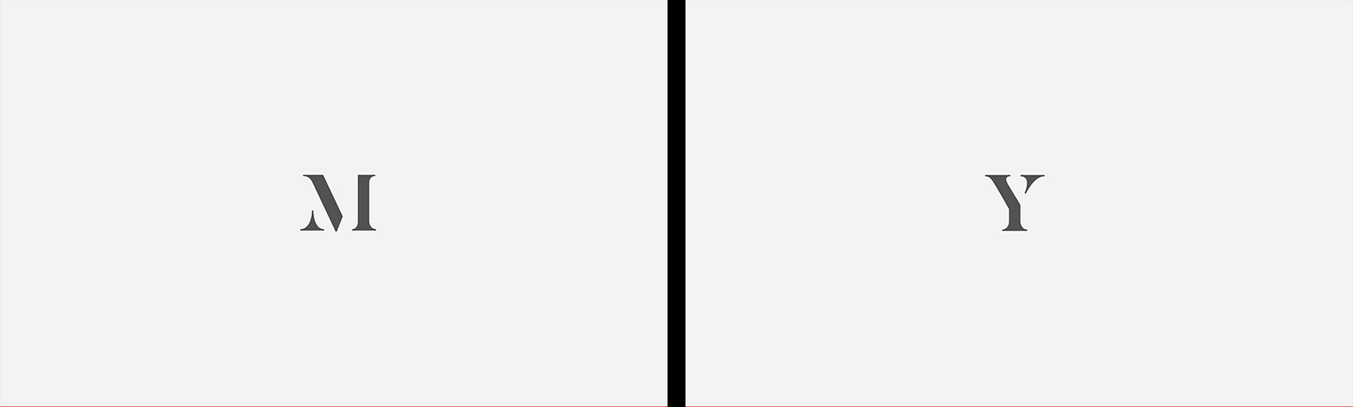
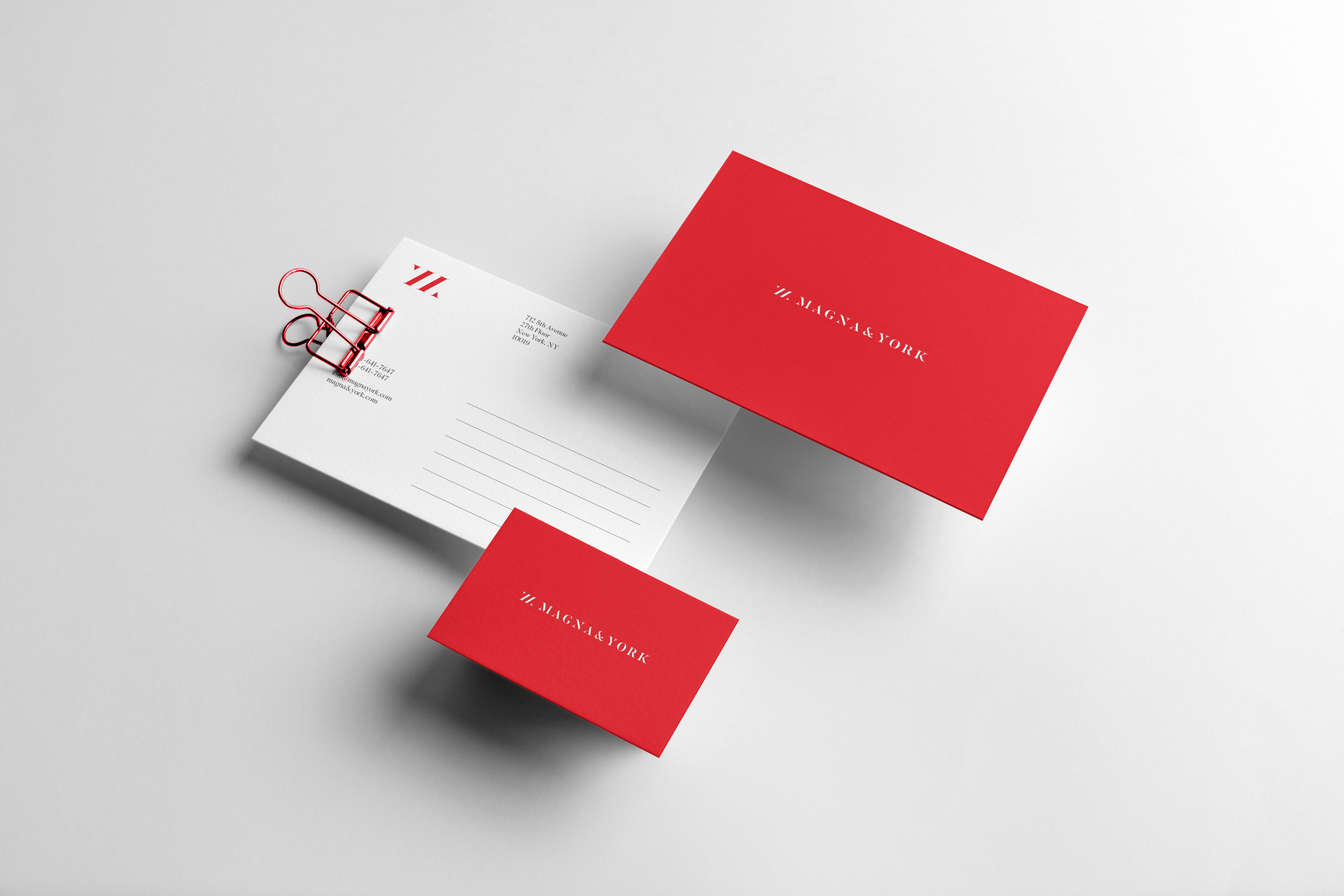
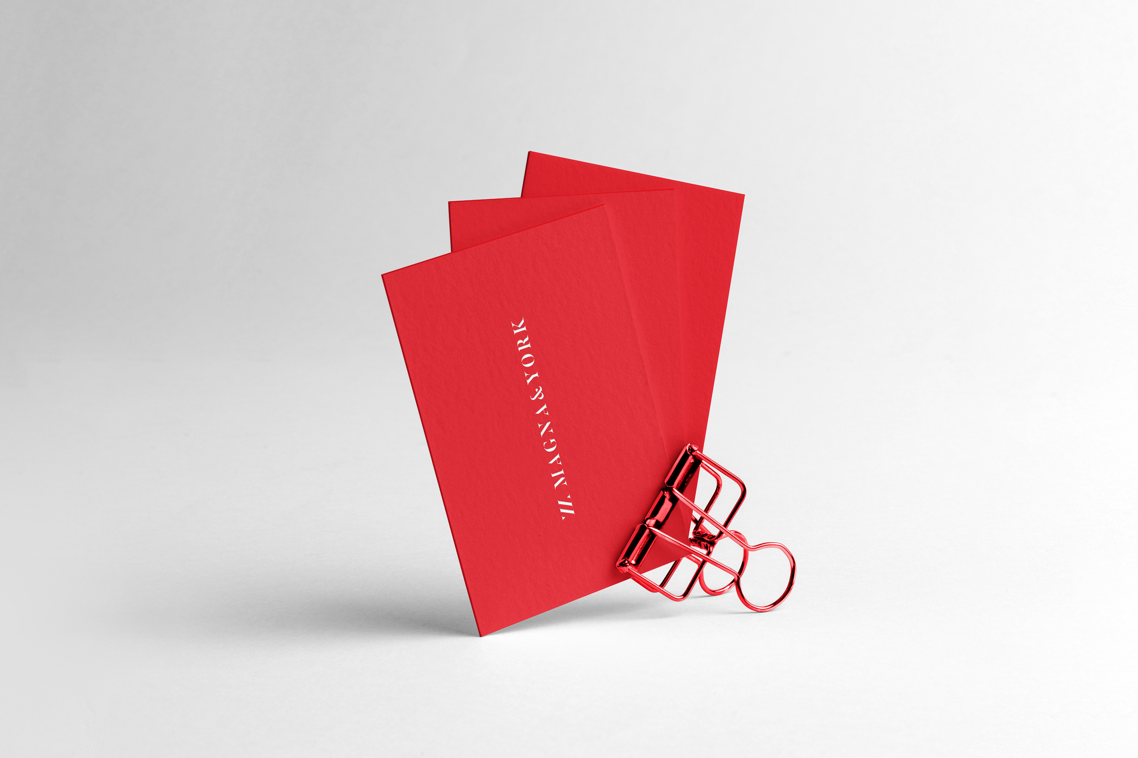
Logo Concept
-
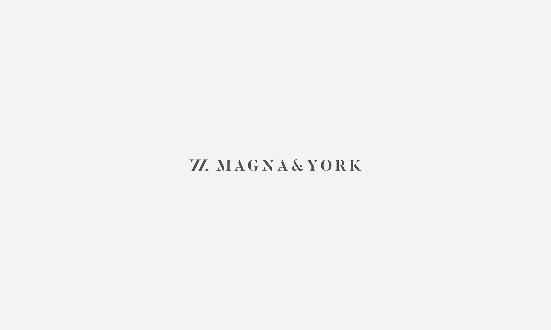
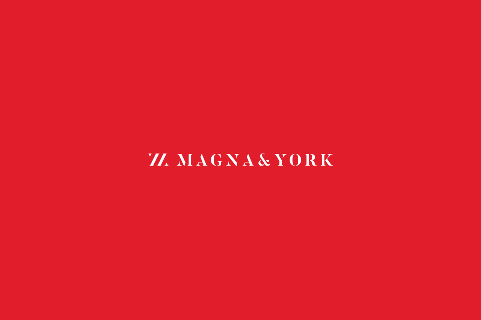
The logo needs to be clean and elegant, without excessive bells and whistles, or cheesy and tacky elements. Additionally, no buildings should be featured in the logo, since that is what everybody does when selling real estate in New York.
-
While sans serif fonts are the trend in graphic design at this age, we used a serif font in a logo design that defies the trend. The current Magna & York logo was designed with this purpose in mind.
While sans serif fonts are the trend in graphic design at this age, we used a serif font in a logo design that defies the trend. The current Magna & York logo was designed with this purpose in mind.