Certosa di San Martino
-
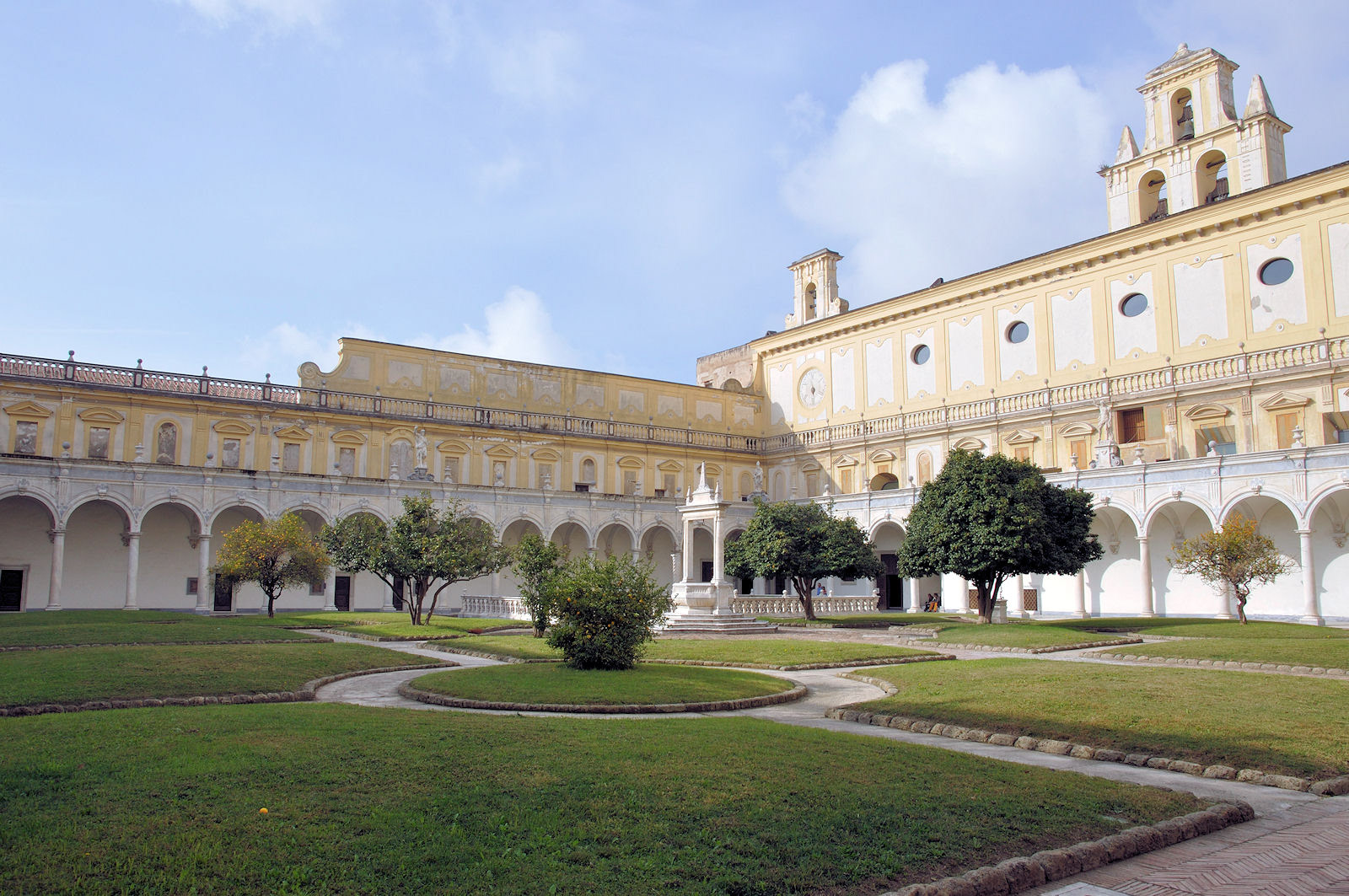
The National Museum of San Martino on Vomero hill has a great location. From its terrace gardens, you have a wonderful view on the Gulf of Naples. Also the wonderful and huge Neapolitan crib Cucinello is worth a visit.
In the National museum of San Martino, you can see a famous collection of Neapolitan nativity scenes including the remarkable Presepe Cuciniello (Cuciniello’s crib), among the finest nativity scenes in the world. It consists of more than 150 people, animals, angels, and about 450 miniature items.
But there is much more to see! The Museum of San Martino belongs to the most important museums in Naples. It includes a church, a charterhouse, beautiful monastery yards and a terraced garden, from which the visitor has a breathtaking view on the Gulf of Naples. Since 1866, the large monastery complex Certosa di San Martino on the hill of Sant’Elmo on the Vomero (close to Sant’Elmo fortress) houses the National Museum of San Martino.
Since 1866, the large monastery complex Certosa di San Martino on the hill of Sant’Elmo on the Vomero (close to Sant’Elmo fortress) houses the National Museum of San Martino. In over 70 halls, it displays exhibits from different eras of Naples city history. There are paintings and sculptures from the 13th to the 19th century as well as a folk art section, a marine- and a Vesuvius section.
The St. Martin’s Charterhouse and Sant’Elmo fortress are the most visible landmark of the city. Worth seeing is also the church, Chiesa delle Donne, which is beautifully decorated with Lanfranco frescoes. After it was extended and restored in the 16th and 17th century, the church consists today of one single nave and three cross vaults.
The building of the monastery began under Charles of Anjou (Duke of Calabria) and was finished in 1368.Particularly interesting is the architectural design and decoration of the building, featuring numerous frescoes, marble paneling, woodcarvings, and floor mosaics, which were created by well-known artists of the 16th and 17th century.
—
Scope:
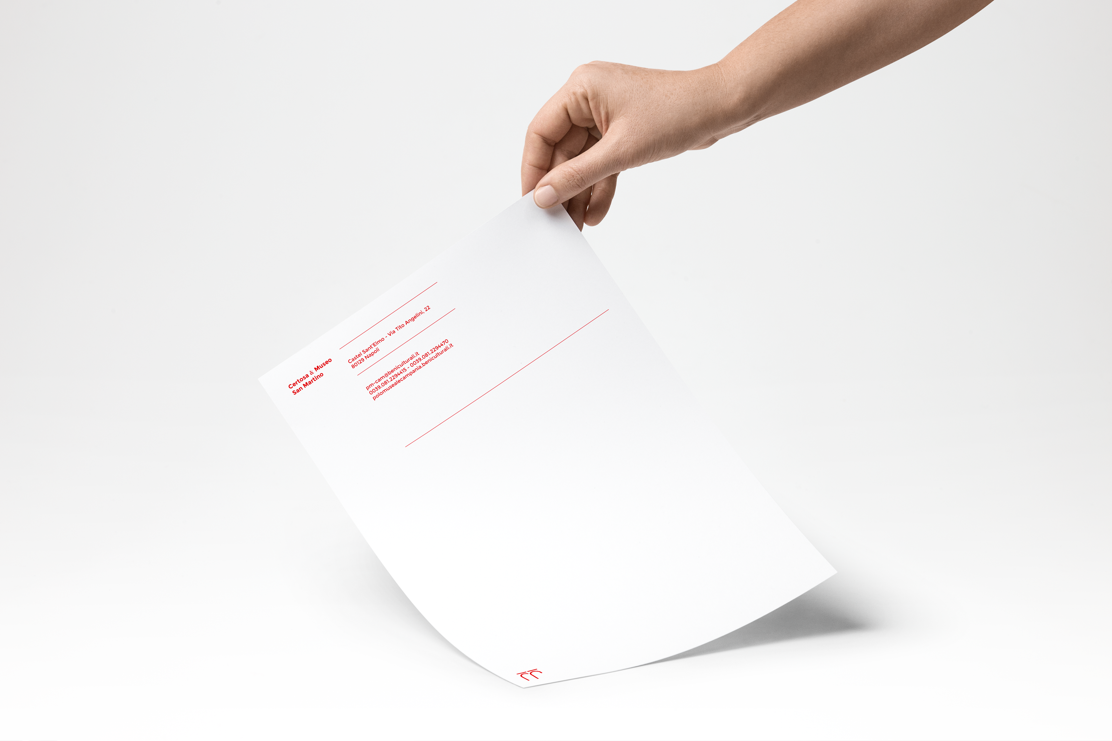
Logo Design and Branding, Print Materials.
—
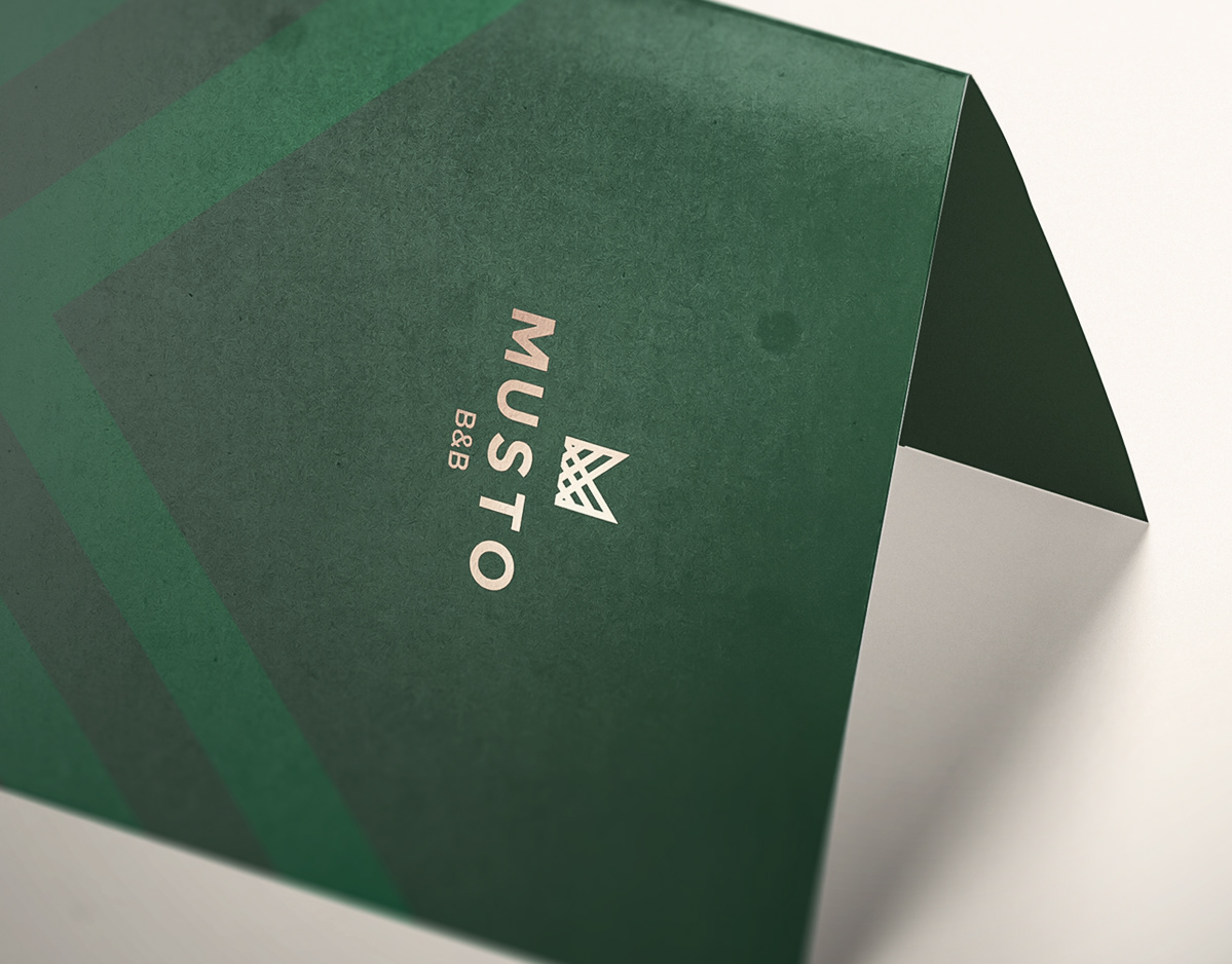
Logo Design
-
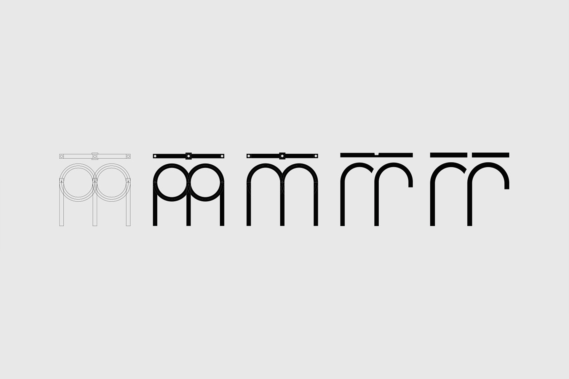
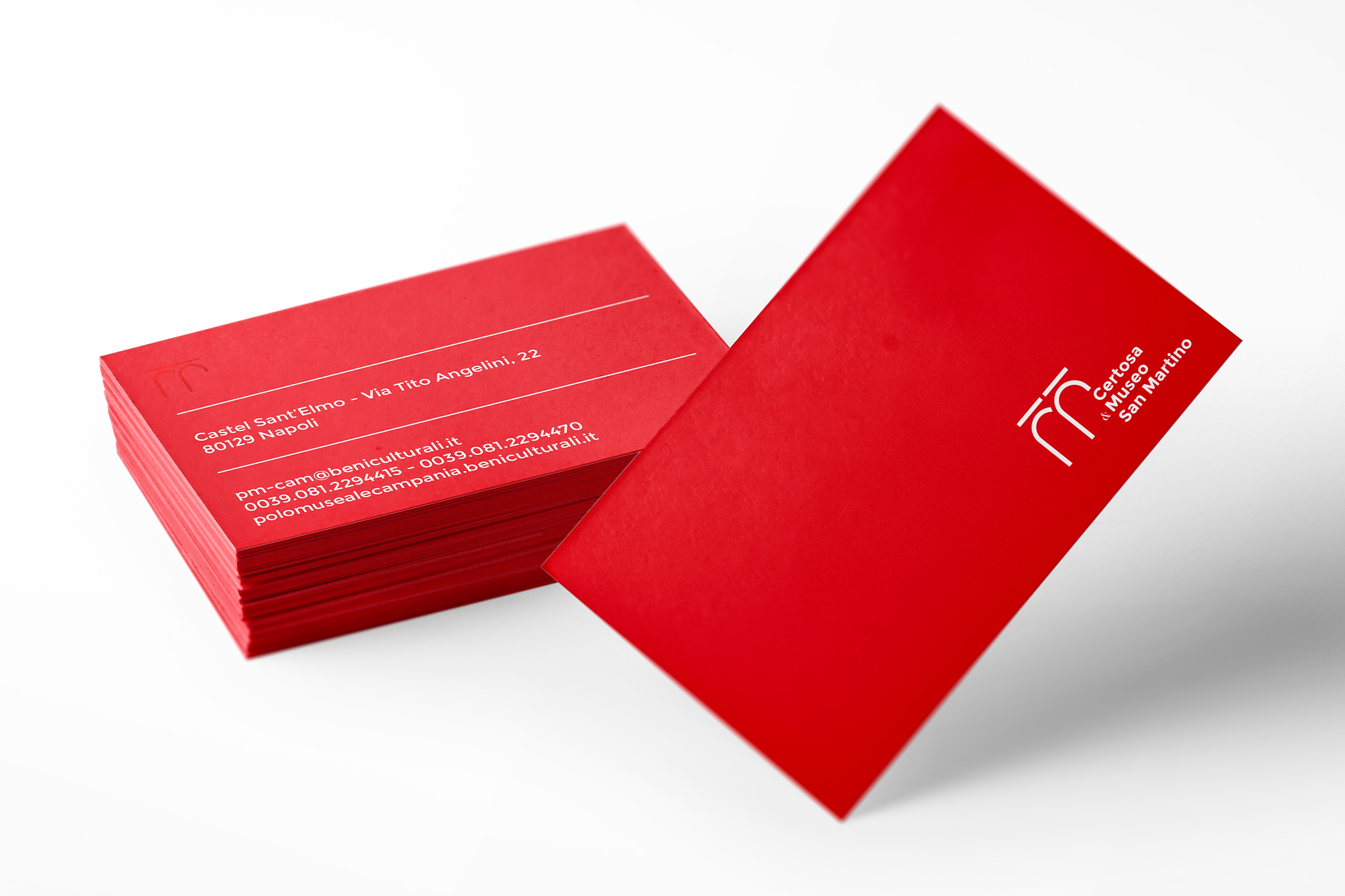
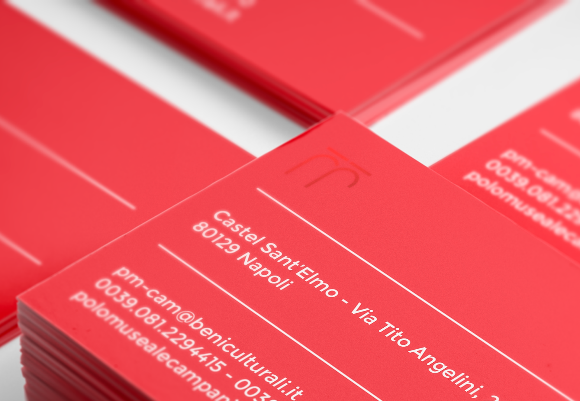
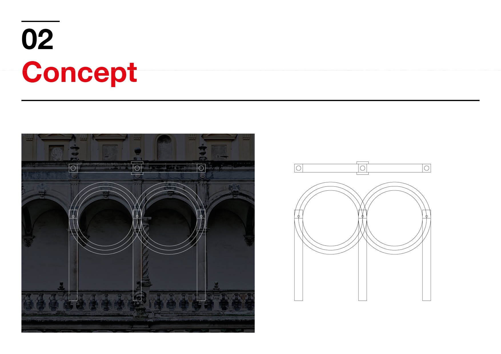
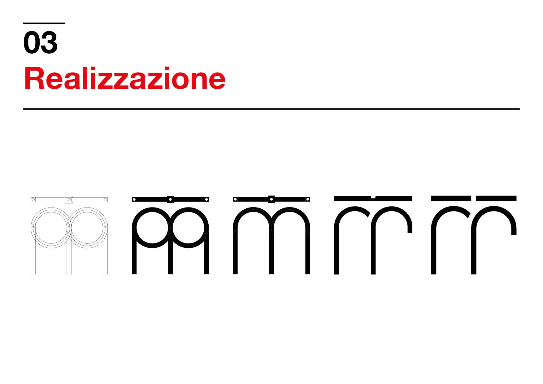
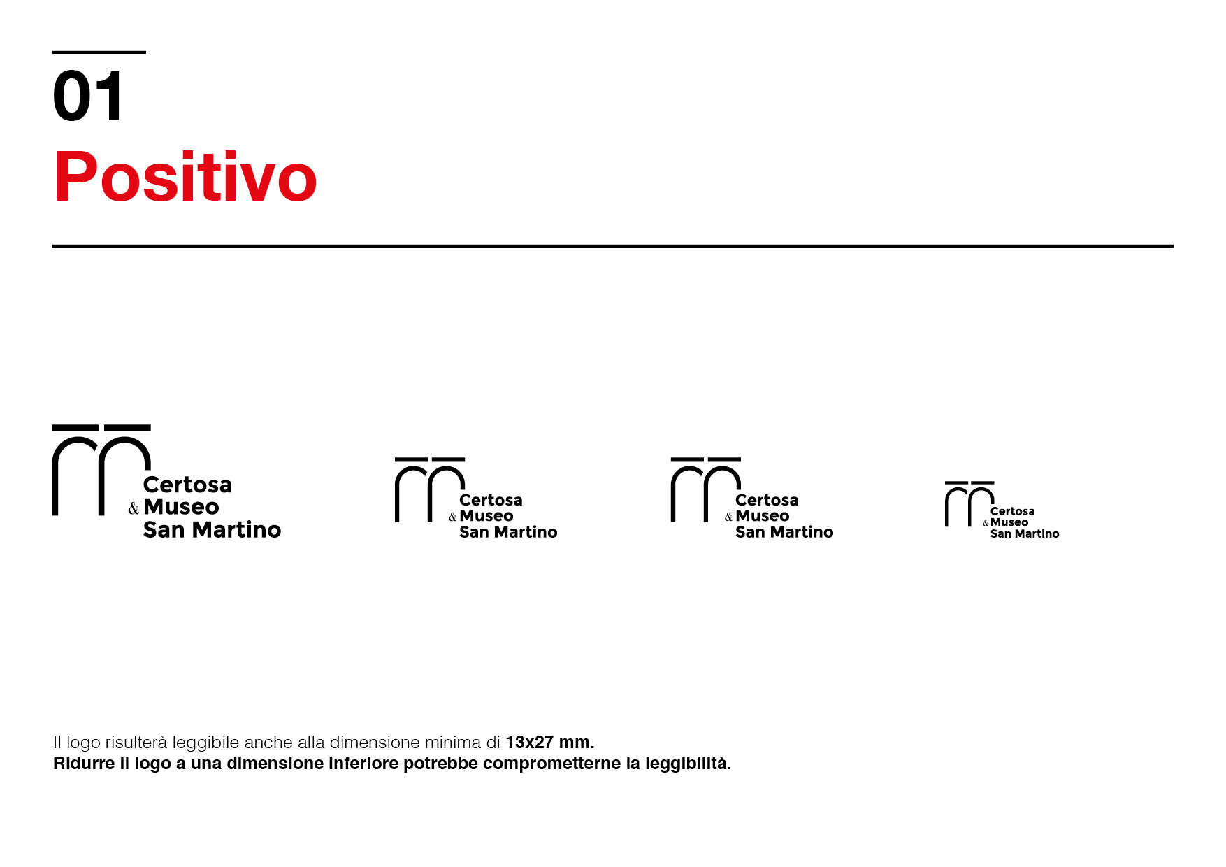
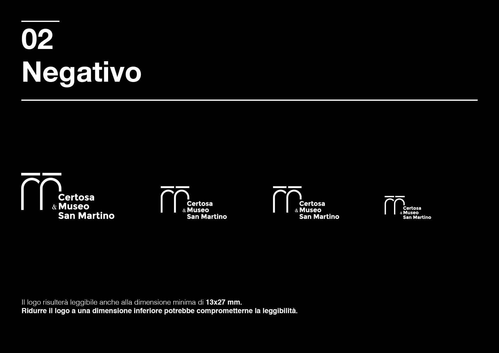
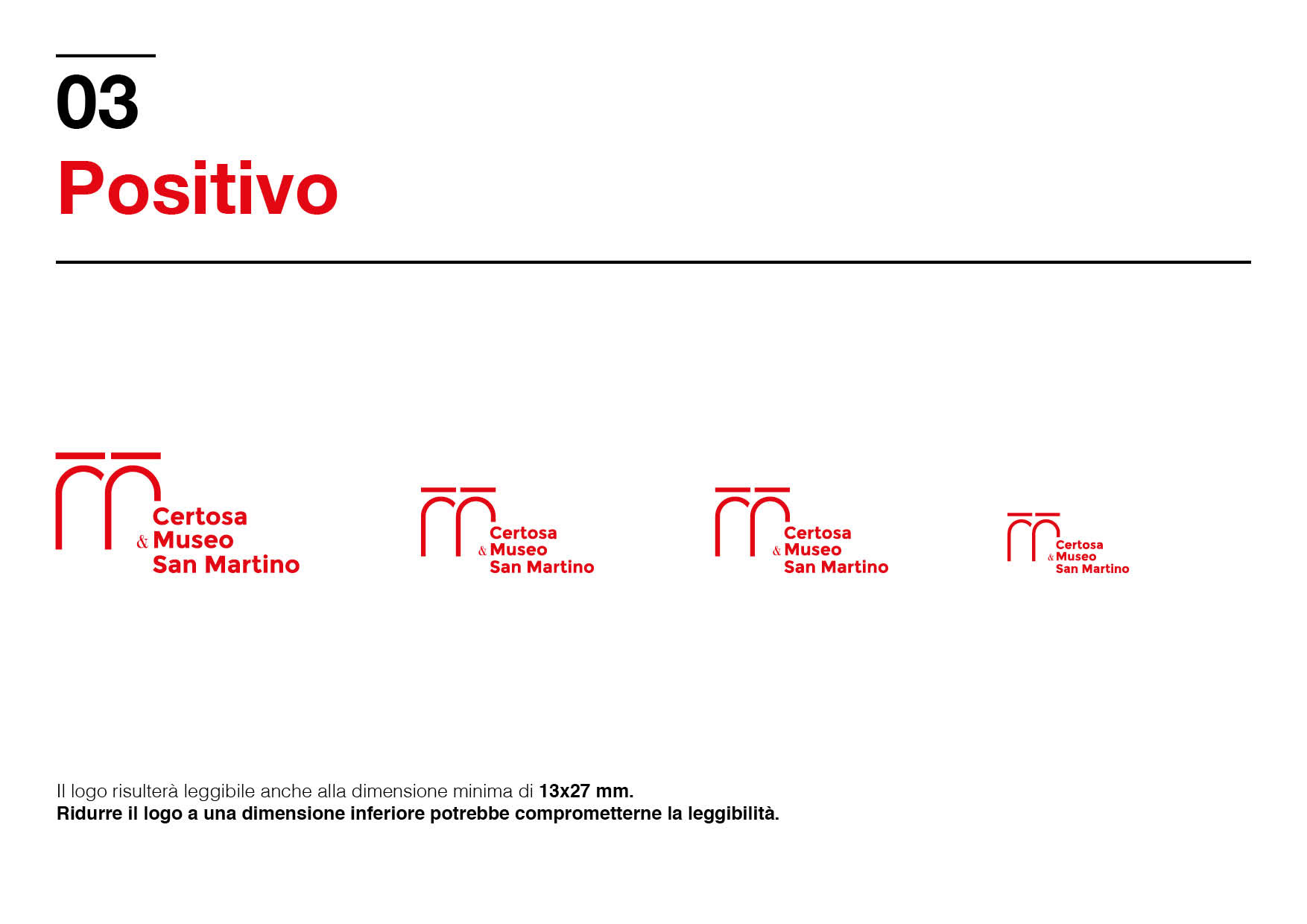
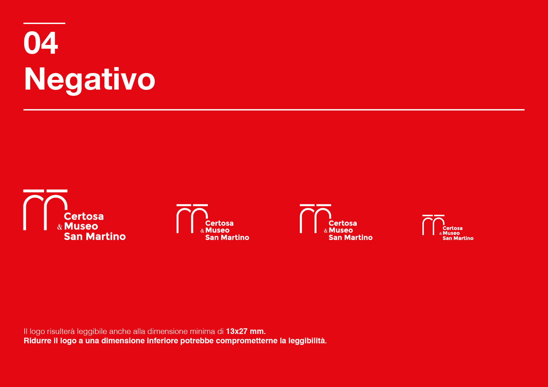
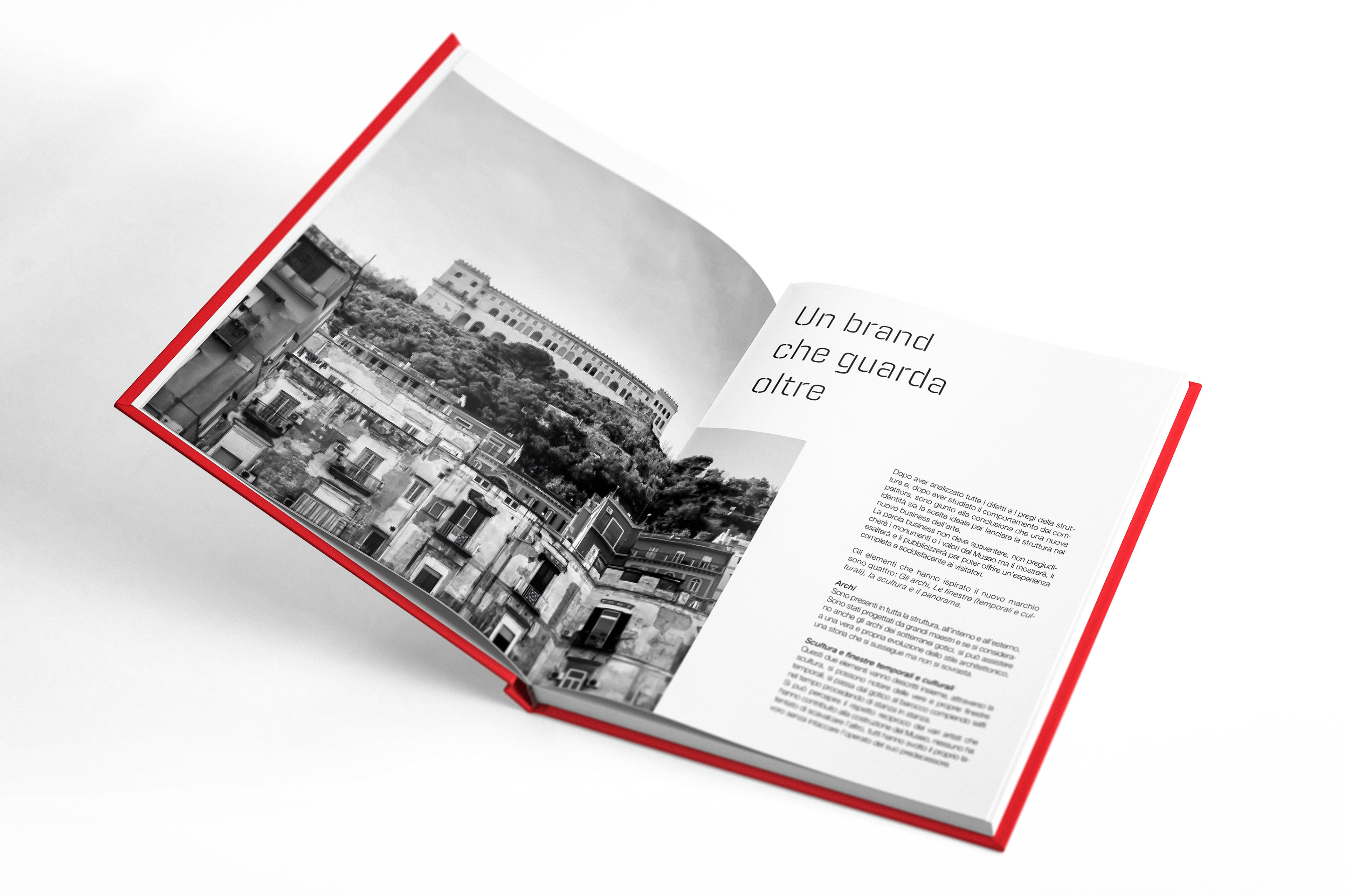
We created a symbol based on the countless arches seen inside the building that tells the story of a location that can be spotted anywhere in the city, making us feel at home just by its presence.
With a logo that works even when separated from the logotype, the goal is to create a dynamic identity capable of immediately drawing the observer to the museum.
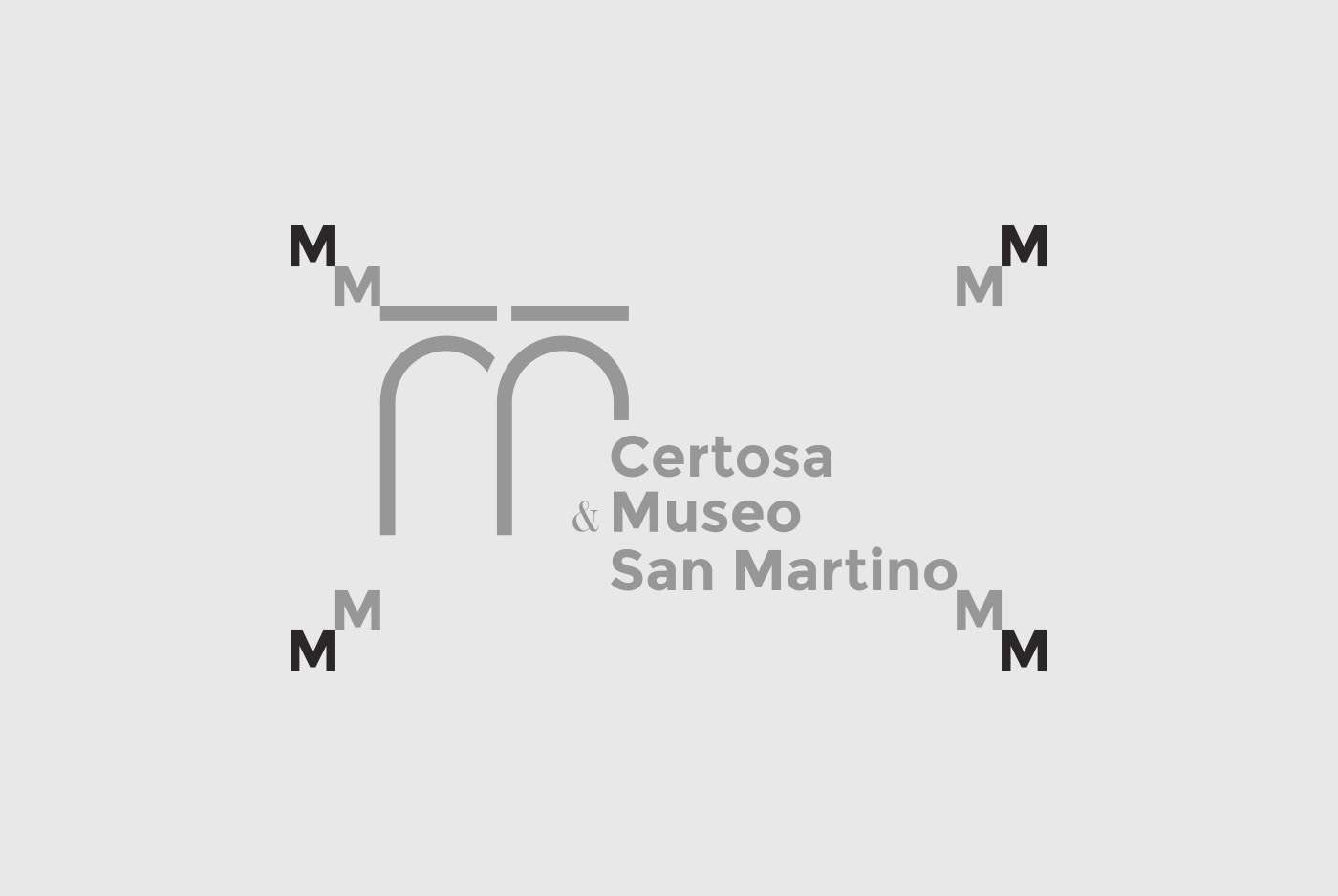
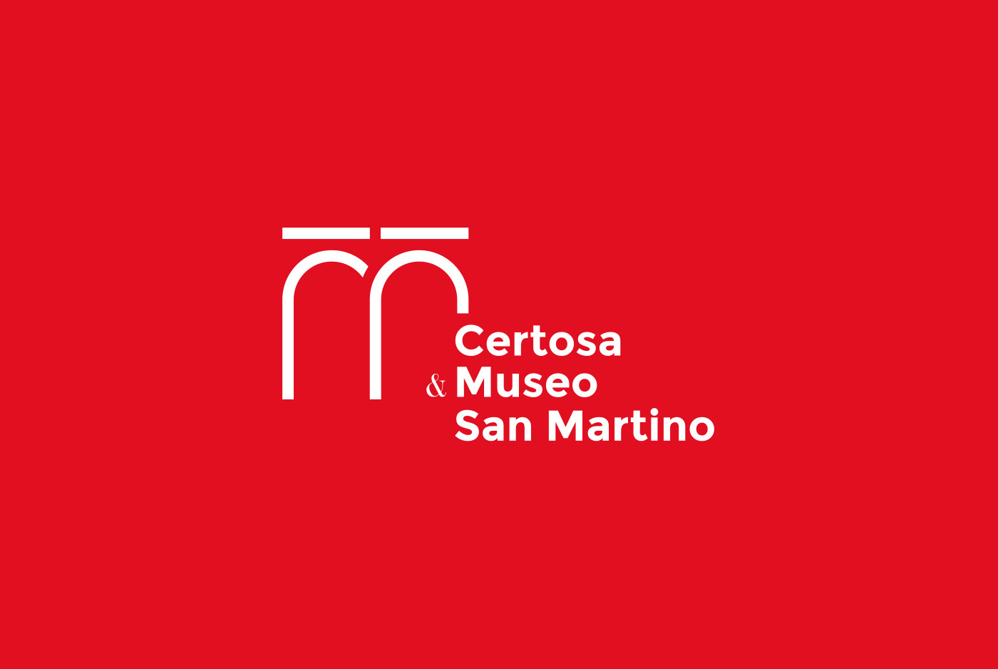
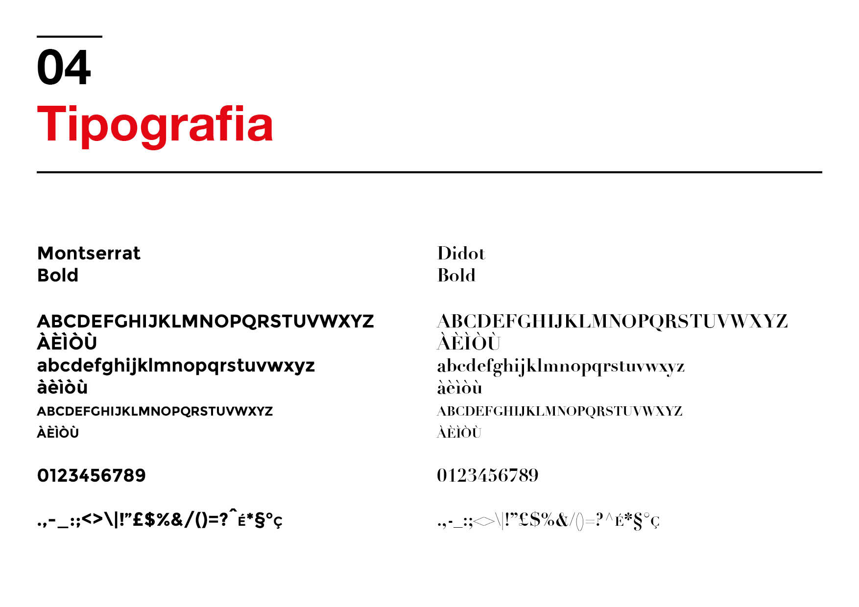
Tradition and modernity are incorporated into the brand. The logotype is made up of 95% Montserrat, and the letter & emphasizes the bonding concept.
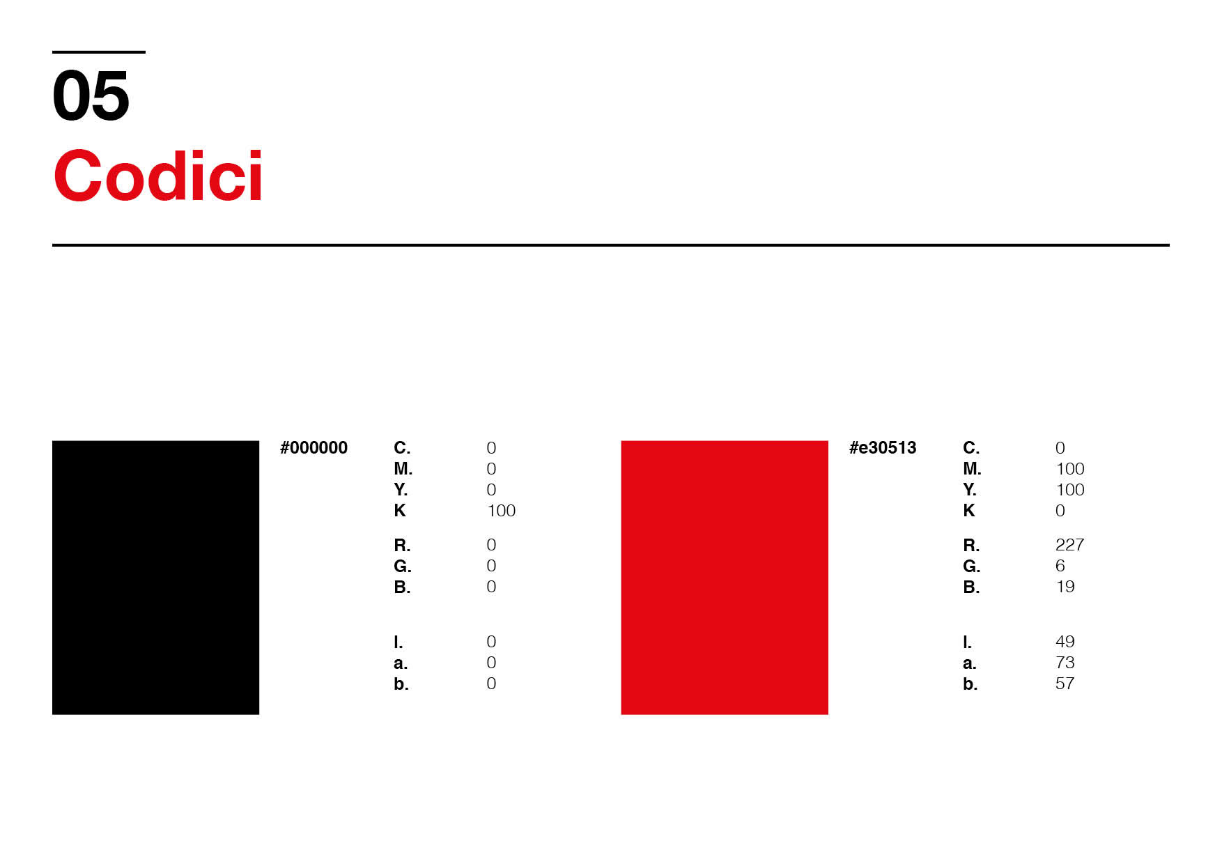
In addition to expressing change, the color scheme (M: 100% Y: 100%) evokes tradition while expressing newness.
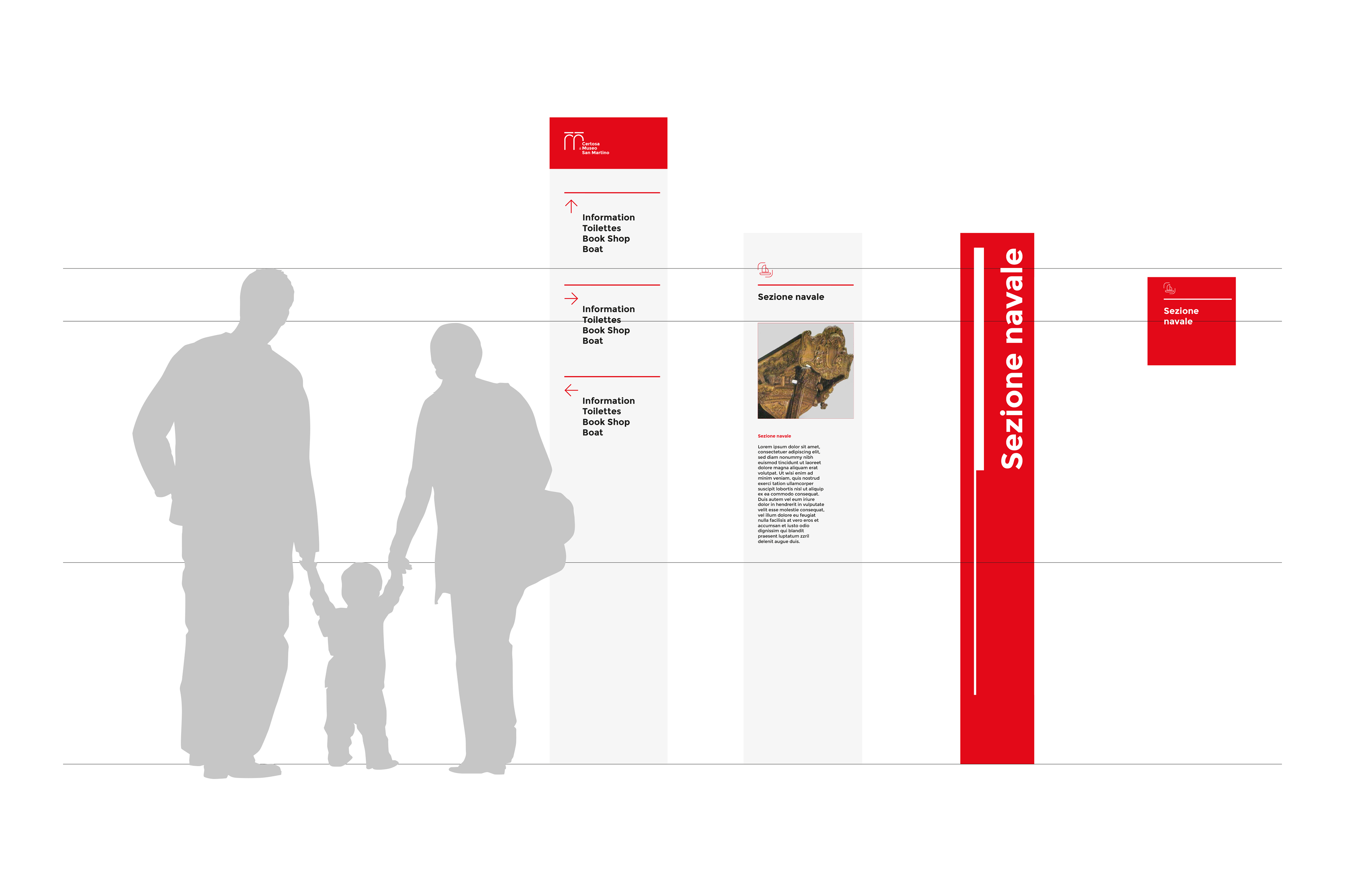
While the old organization of the museum still exists, the new identity provides a fresh perspective that is captivating and immediately accessible, therefore increasing the number of people that are able to learn. Moreover, pictograms used for branding preserve brand identity parameters in order to give visitors a sense of continuity.