The Client
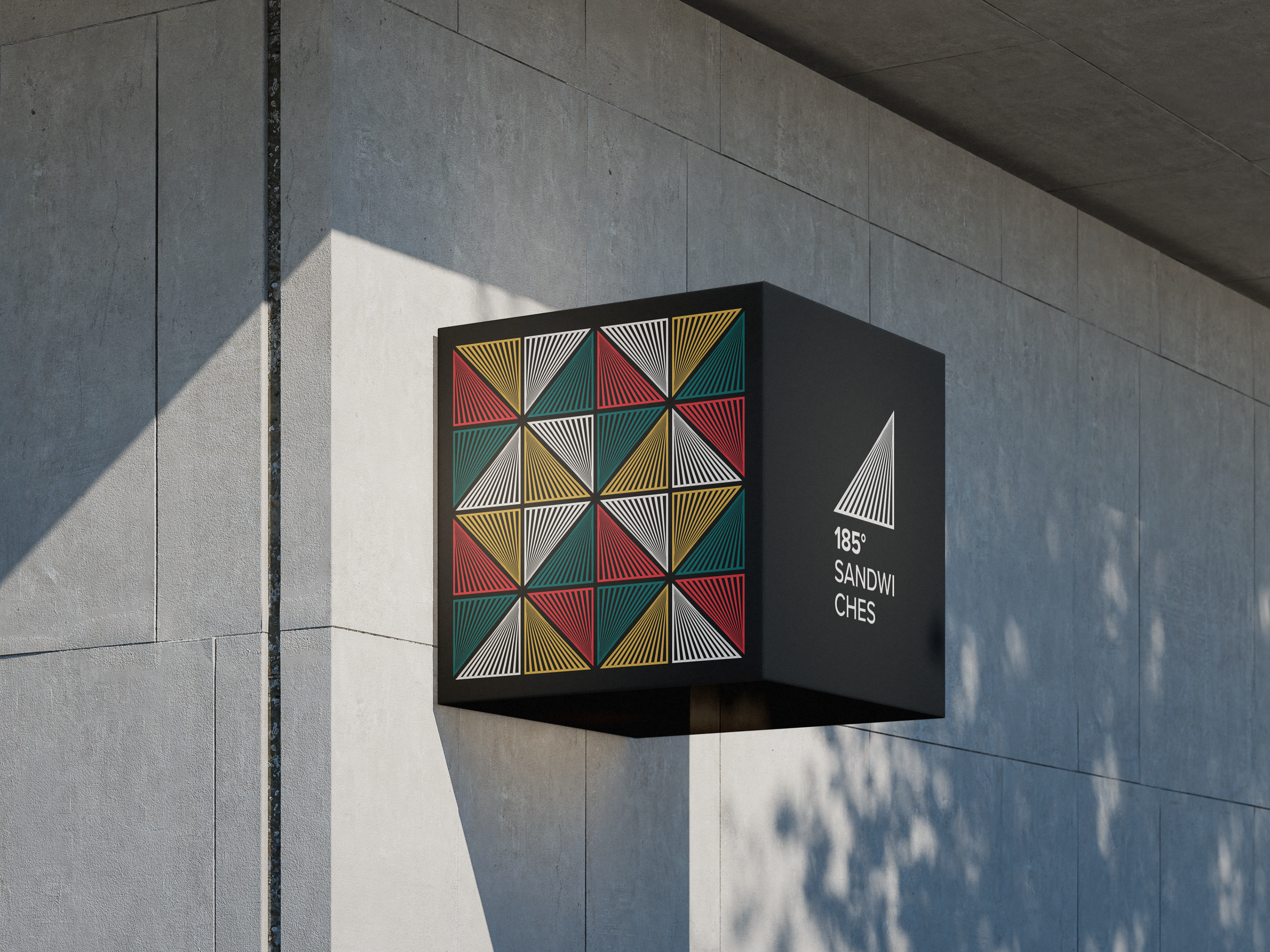
185 Sandwiches is a standout culinary concept founded in 2024 by Yuriy Ackermann and his chef partner, located on Queen Street in the heart of Auckland.
Born from the belief that recessions breed innovation, the shop takes a focused, minimalist approach: make one thing, sandwiches and make it exceptional. Known for their clean, ingredient-driven menu (with bacon that’s earned local praise), 185 Sandwiches combines culinary precision with a deep commitment to sustainability.
Partnering with Critical., the store features a fit-out made from Cleanstone surfaces crafted from 100% recycled soft plastics and fishing nets diverting over 200 kg of waste from landfill and saving nearly 700 kg of CO₂ emissions.
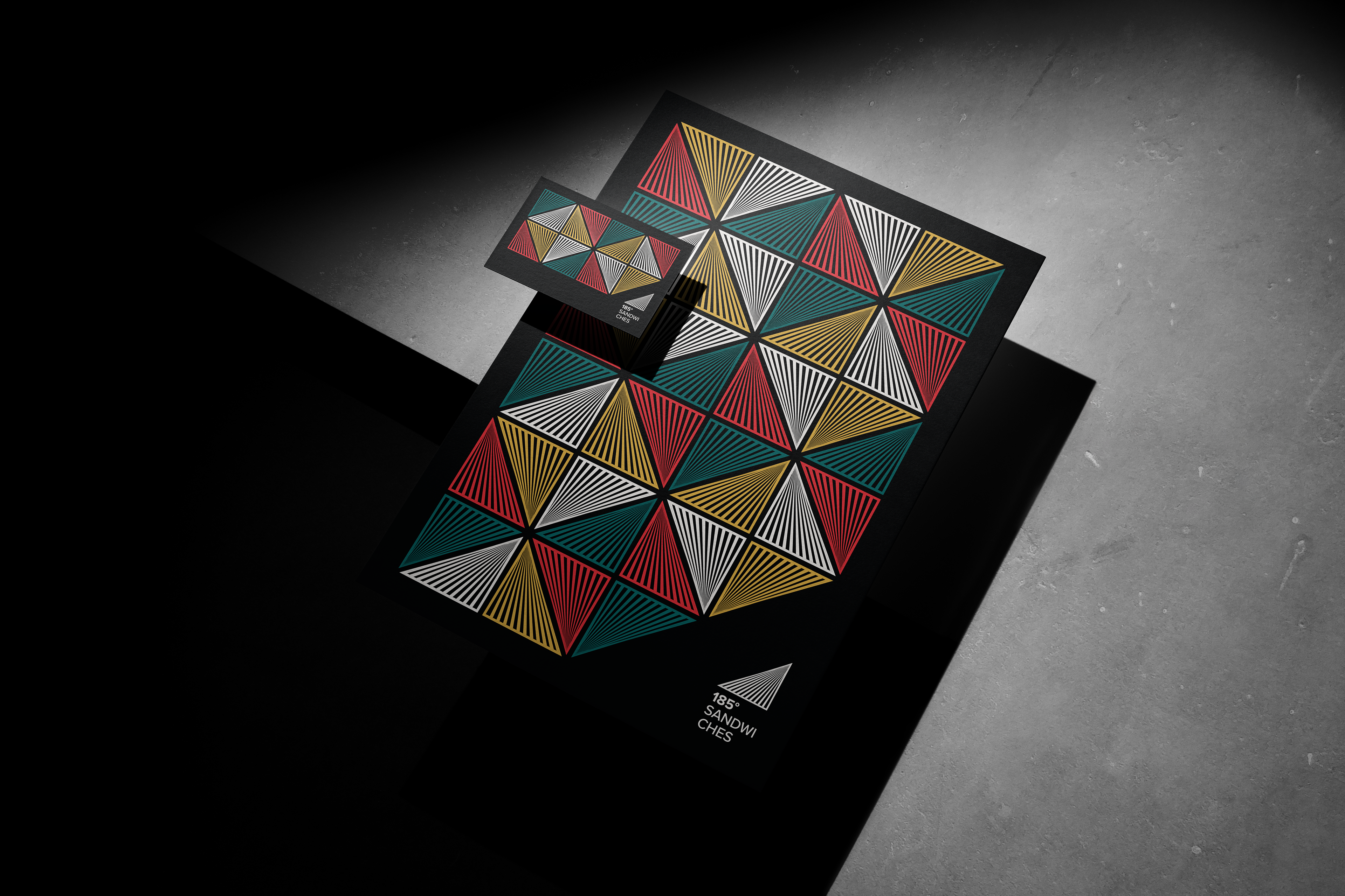
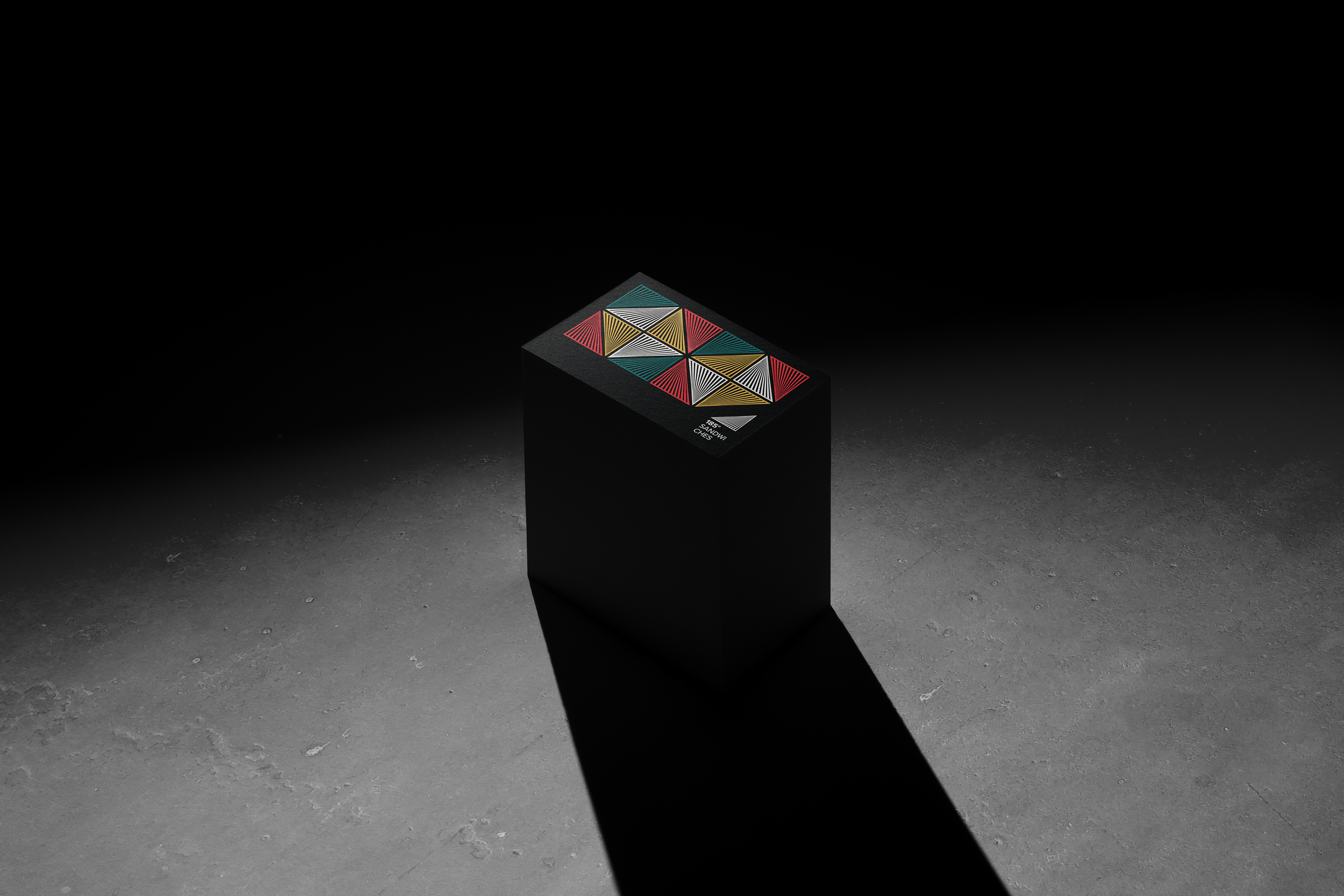
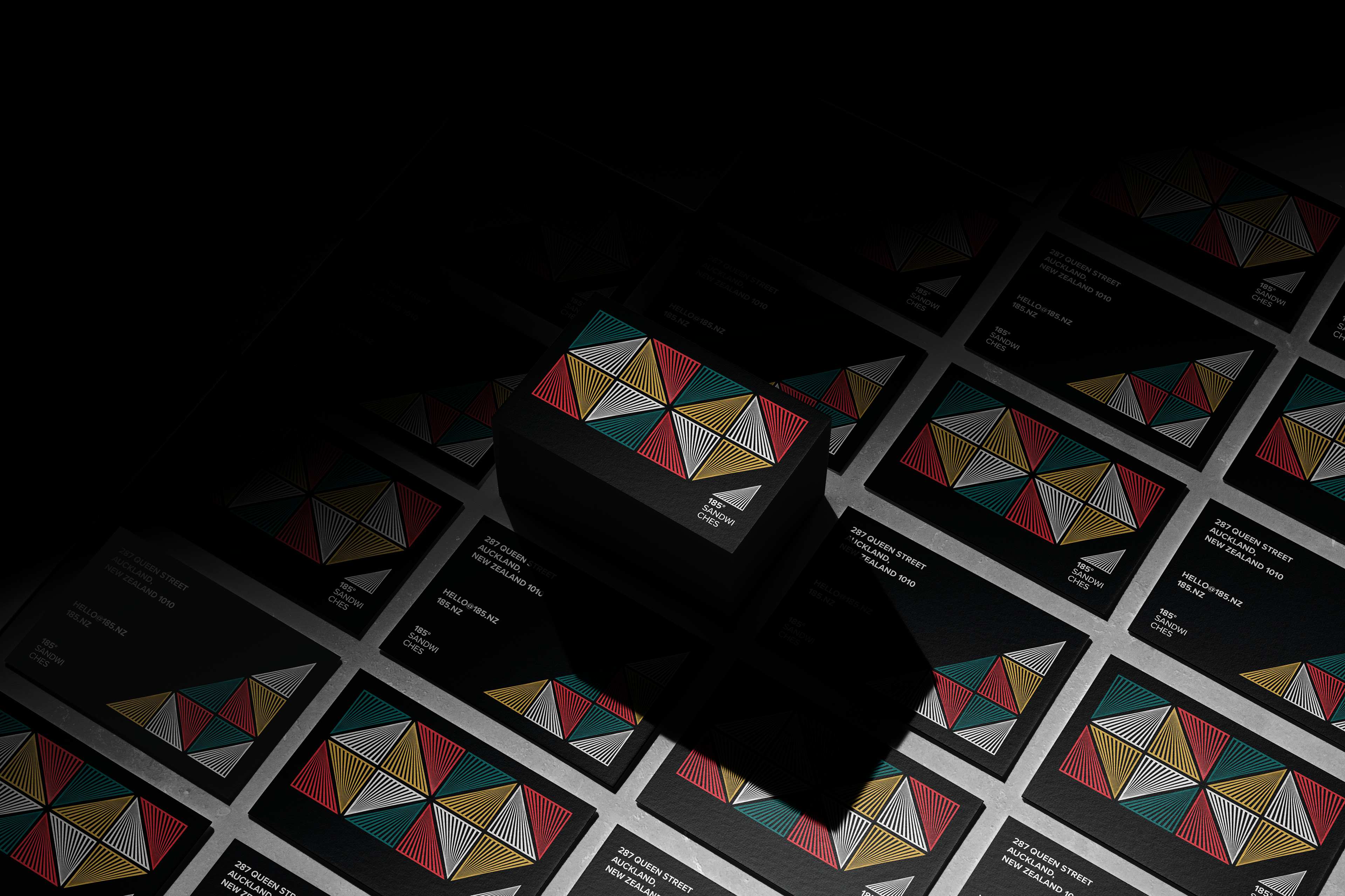
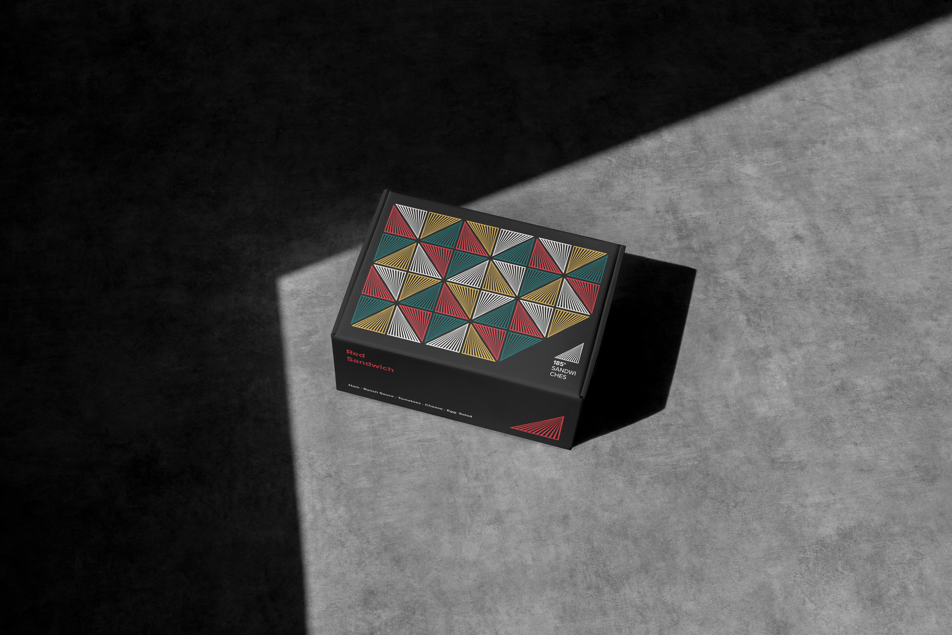
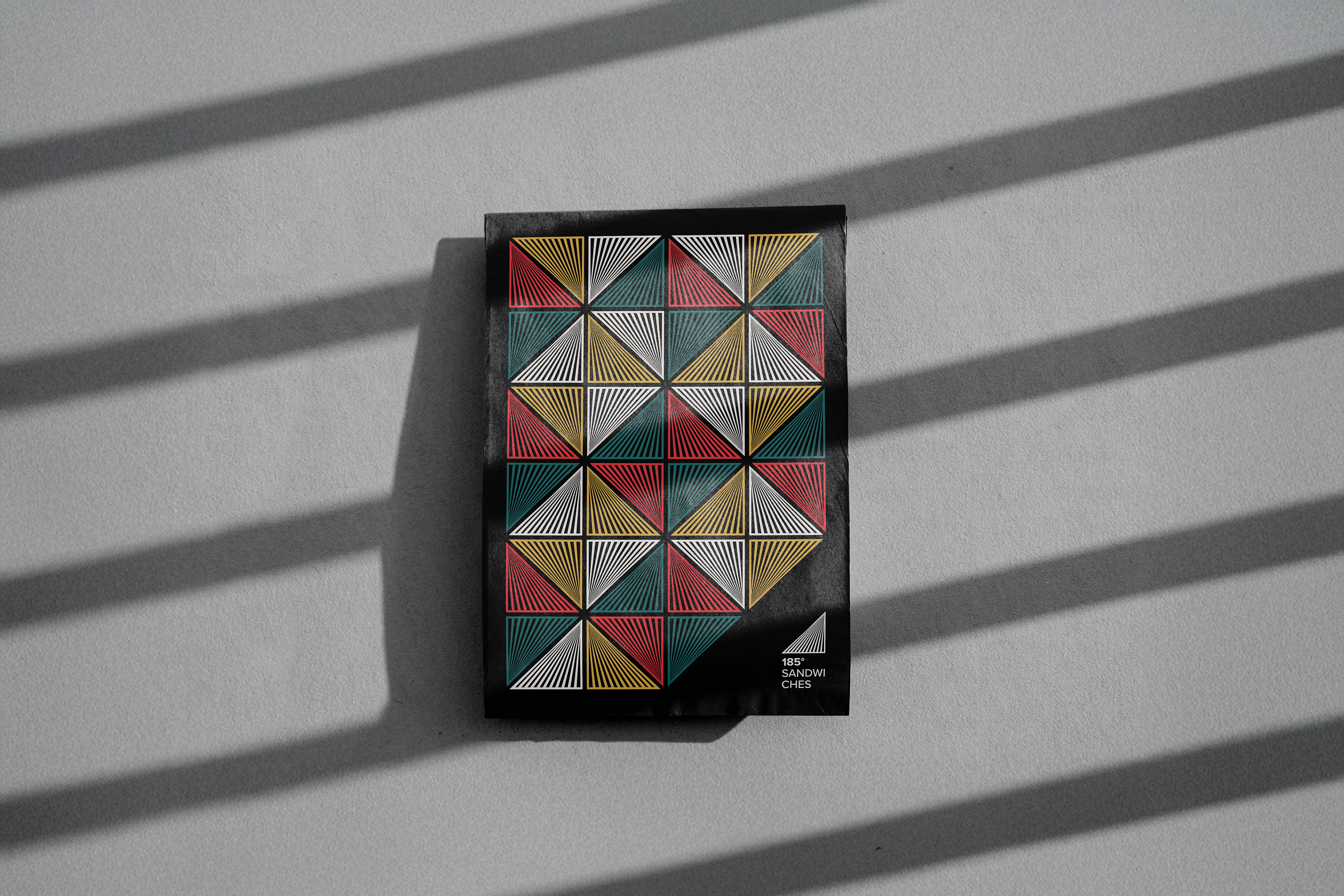
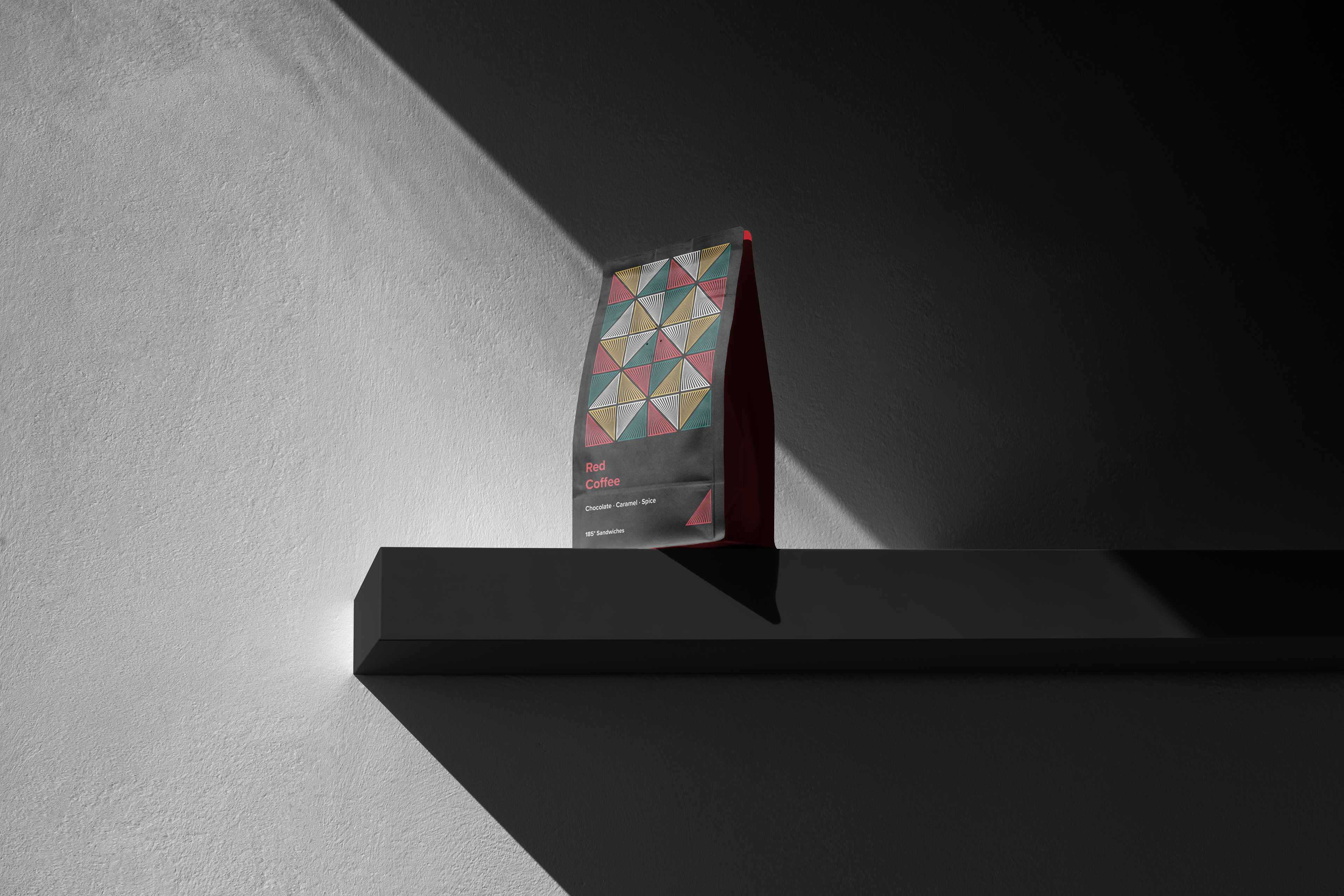
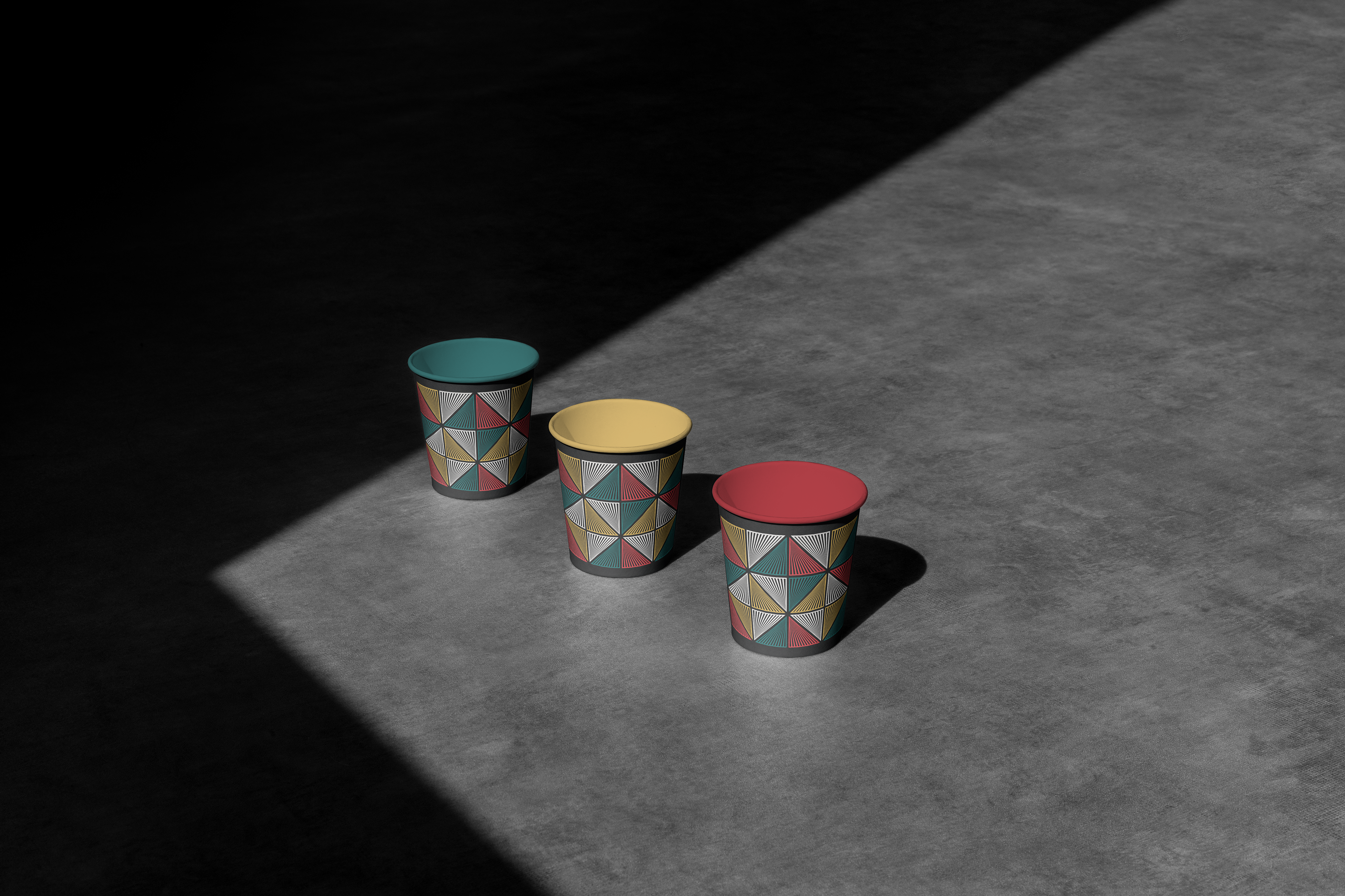
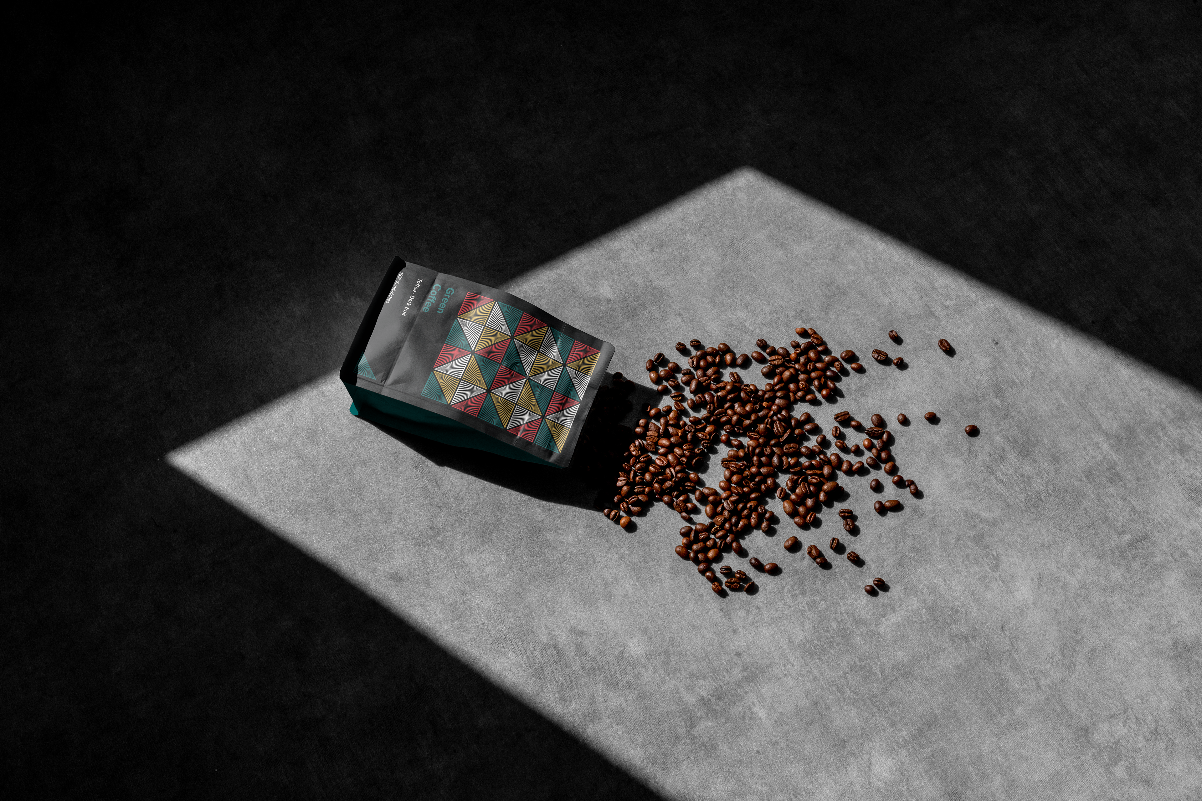
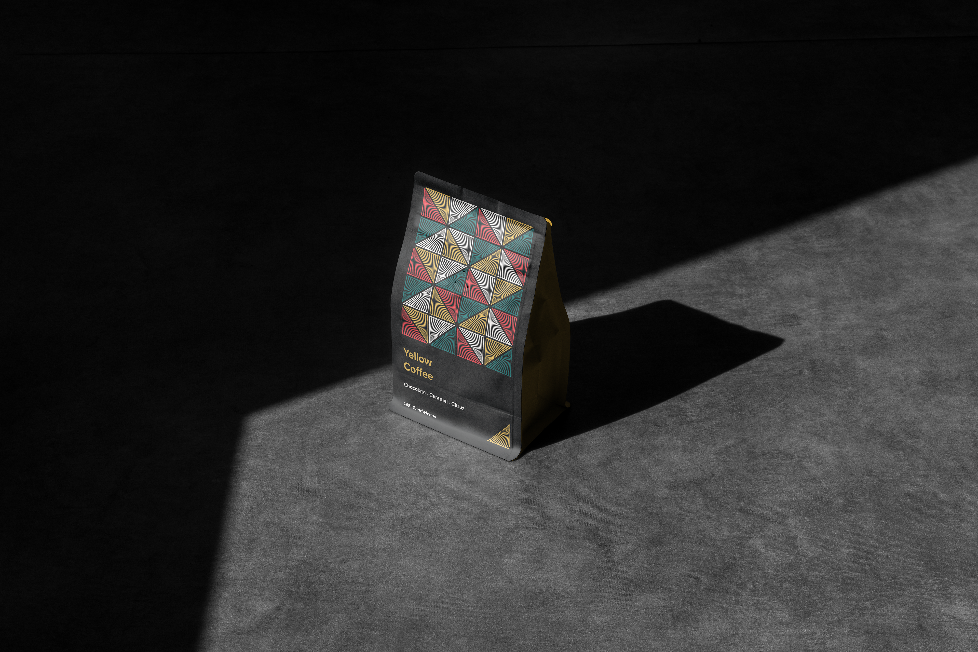
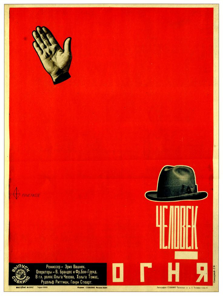
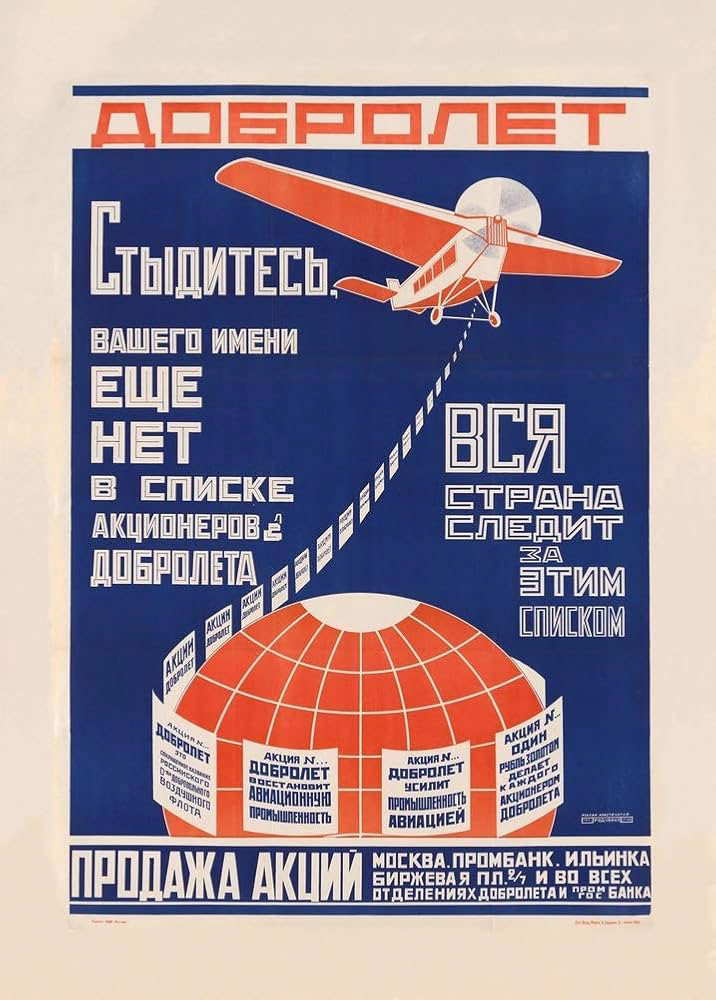
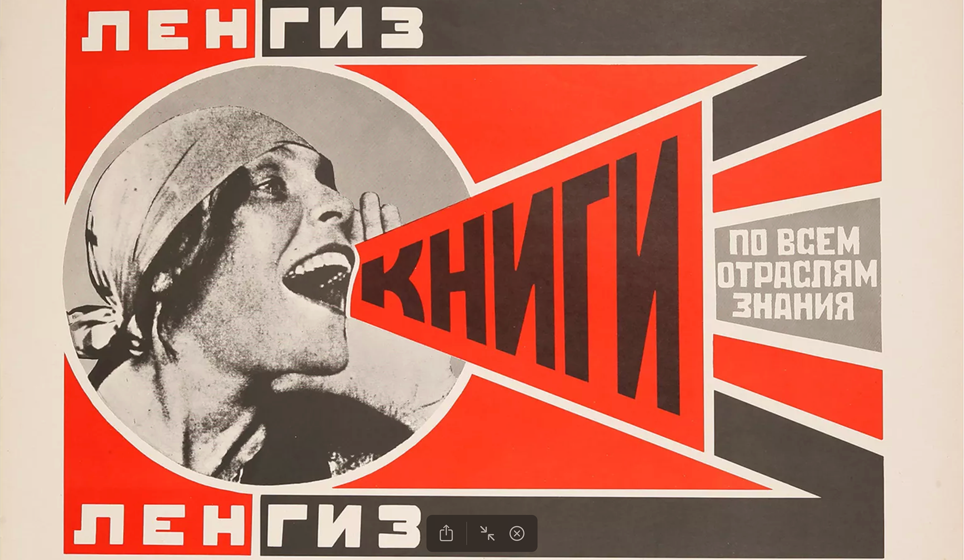
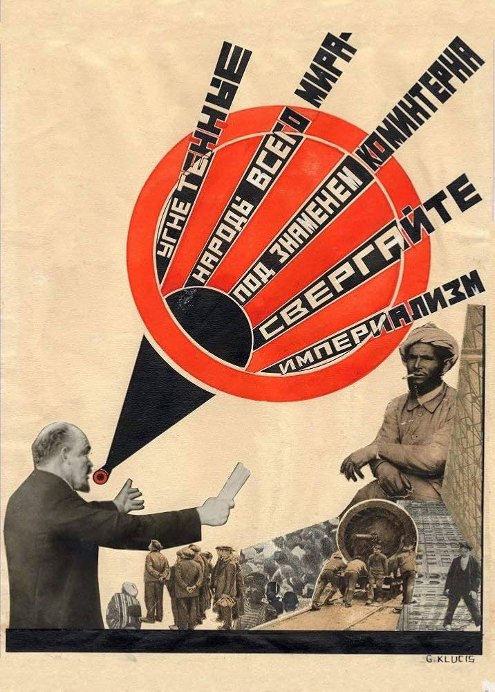
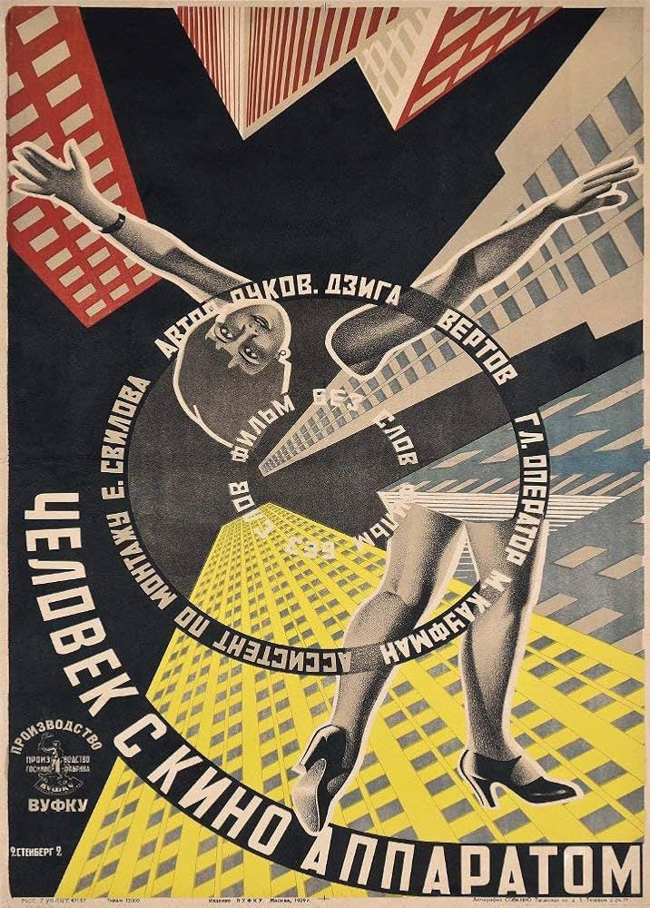
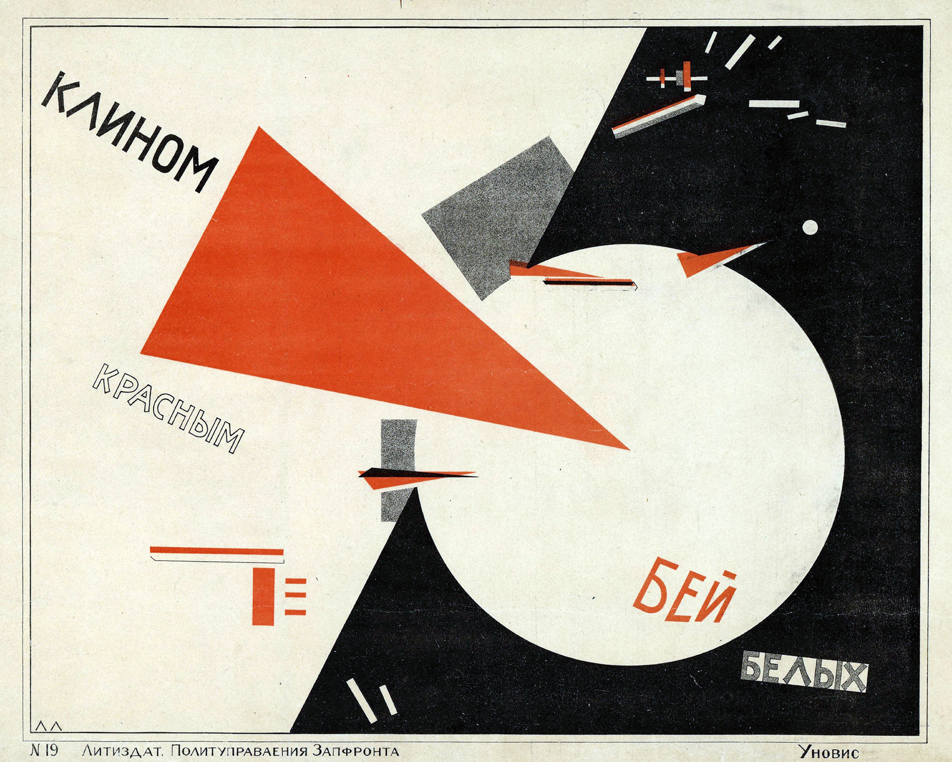
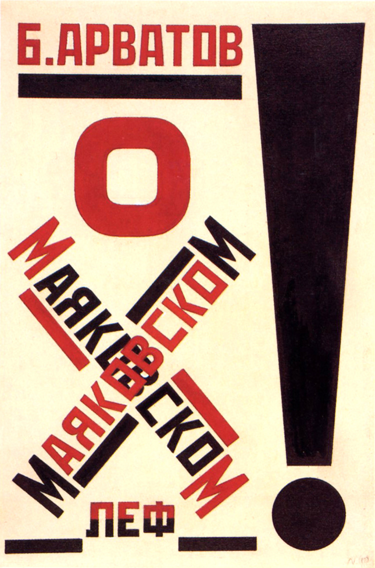
The design, inspired by 1920s constructivism, balances sleek, cool aesthetics with red, yellow and green tones and warm materials. With its strong community roots, tight menu, and eco-conscious ethos, 185 Sandwiches redefines what fast, local hospitality can look and taste like.
Scope
Brand Identity, Logo Design, Print Materials.
Elle Visual | Instagram | Email | Website | My Mockup
Concept
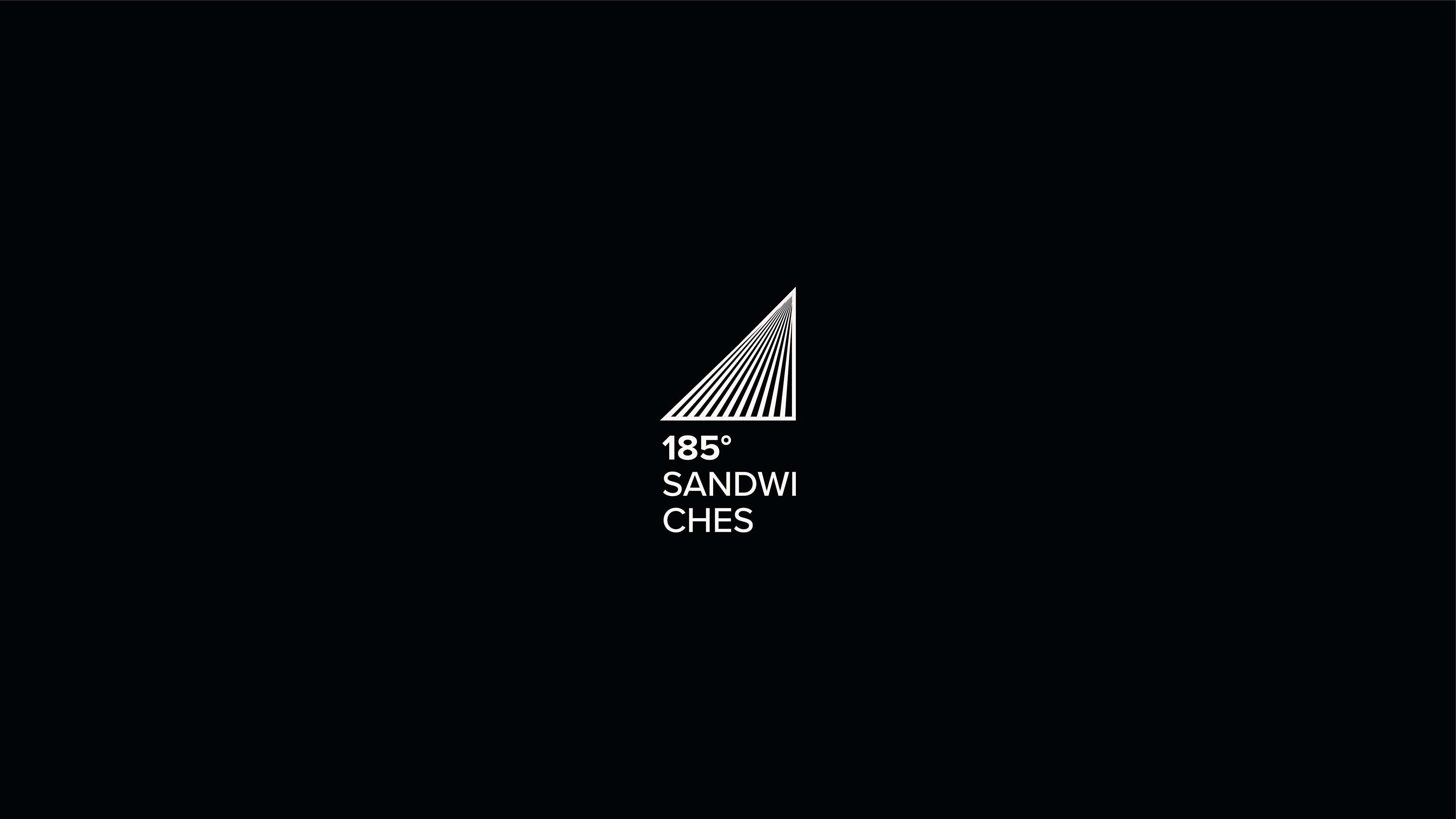
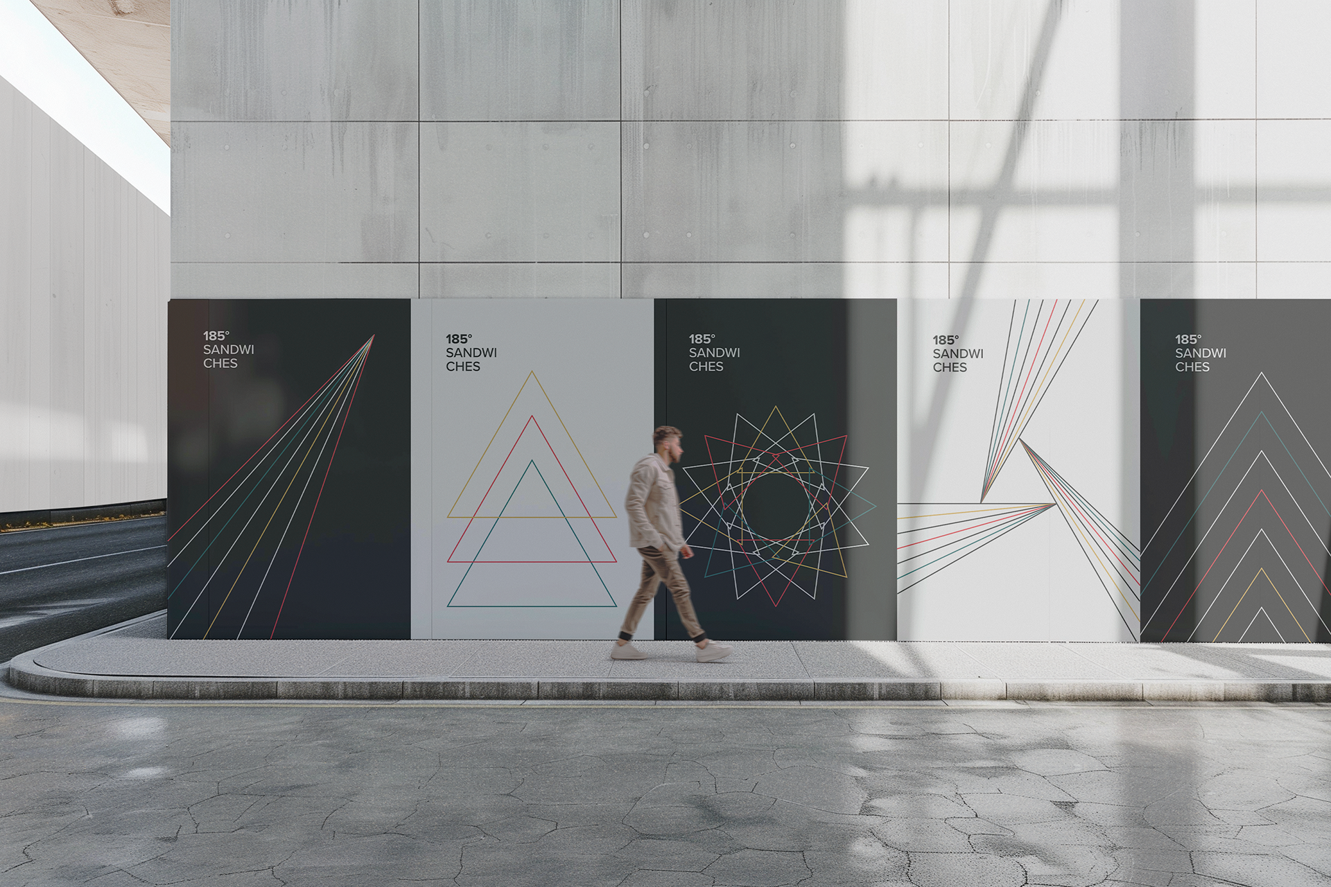
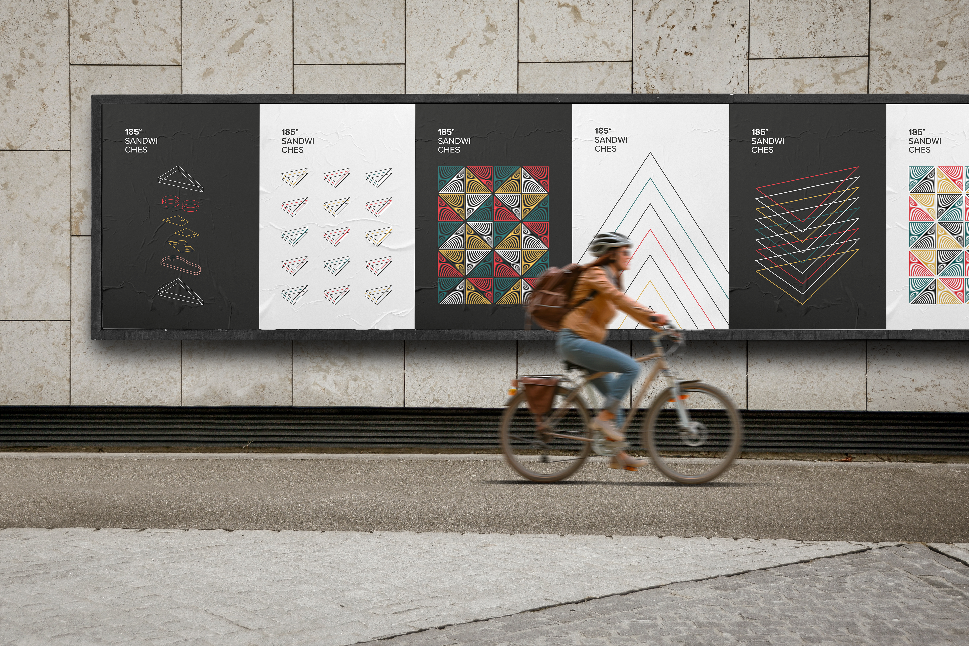
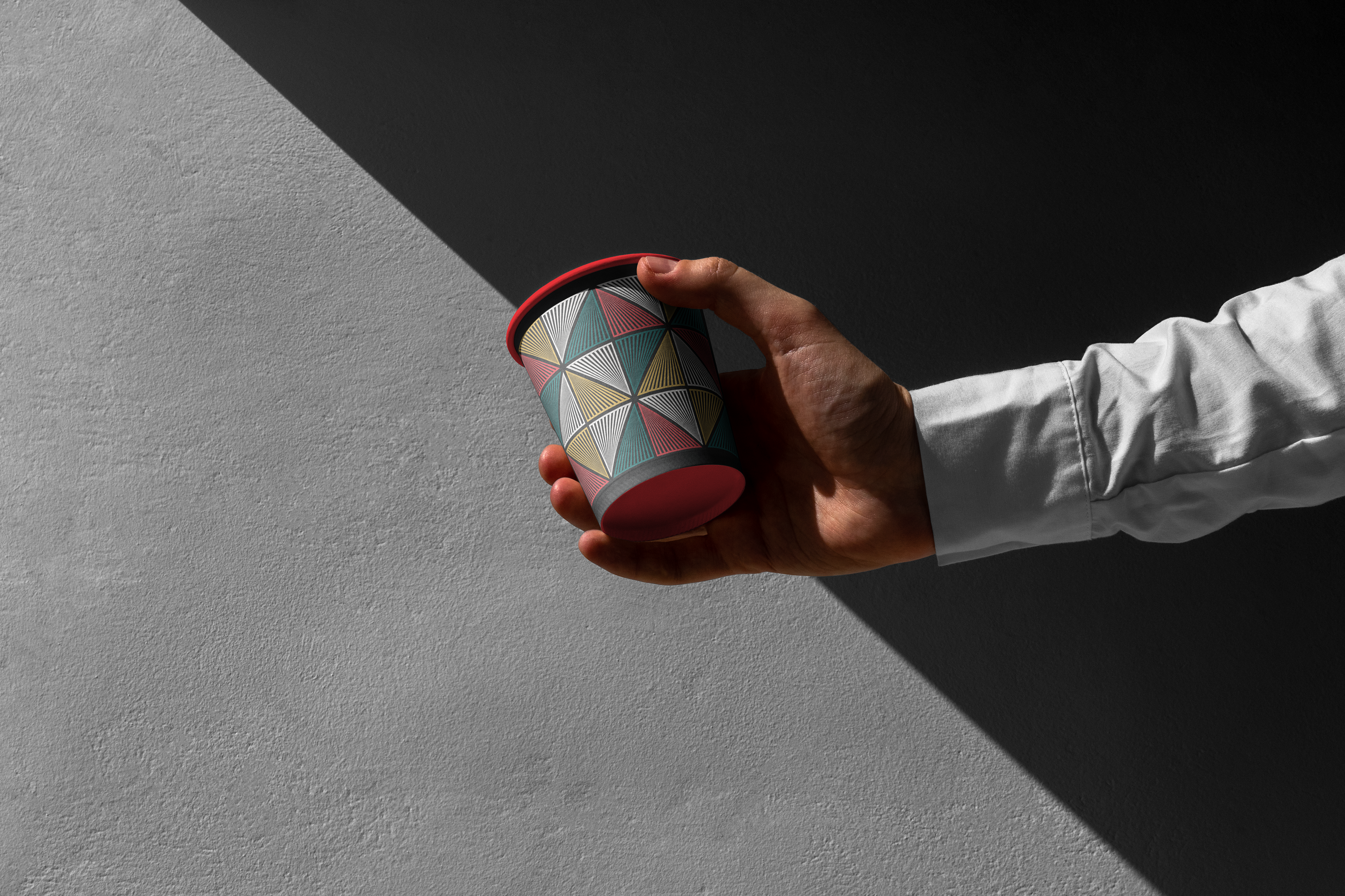
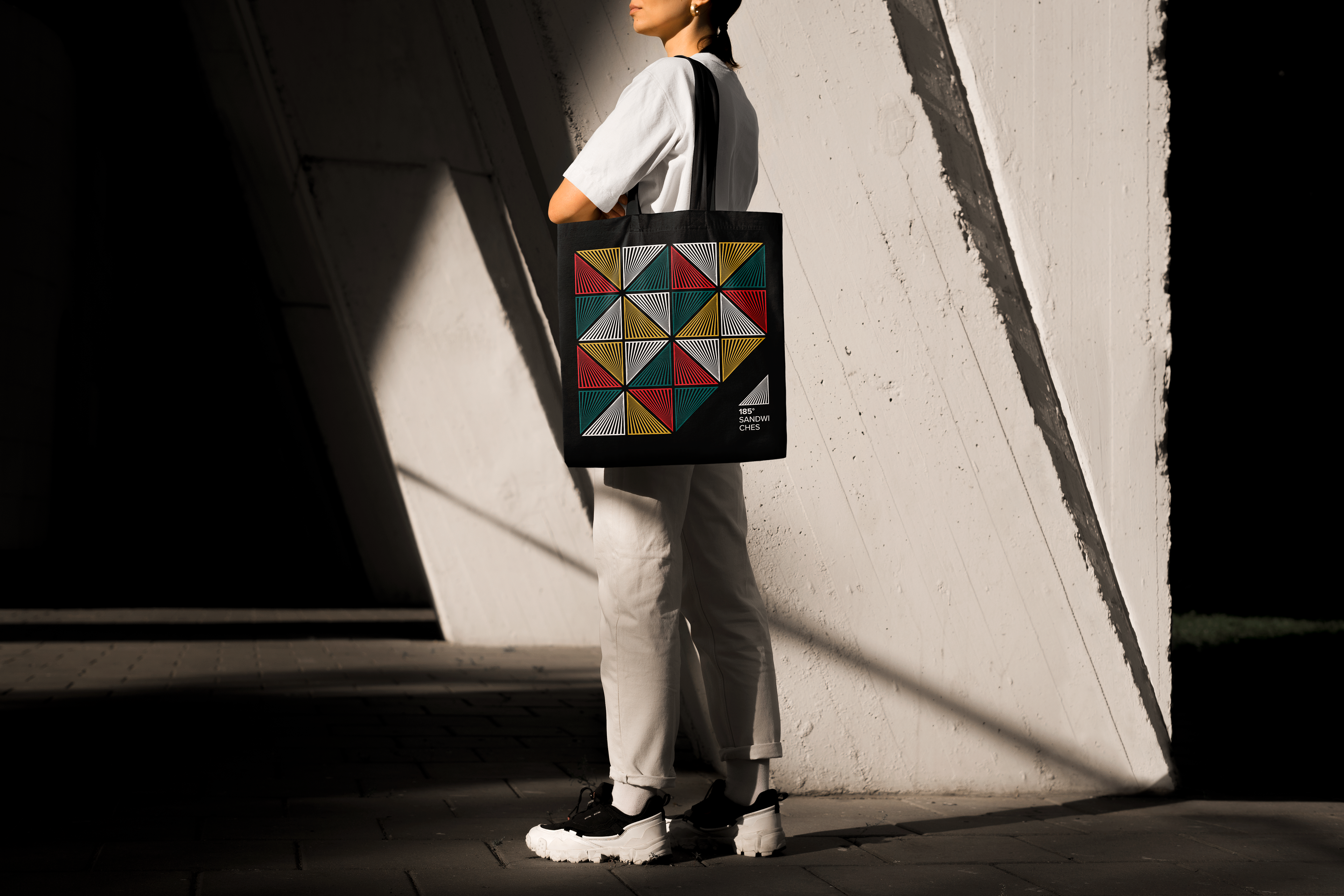
I started the logo design with the simple, iconic shape of a triangle to evoke the classic form of a sandwich. From there, I added more triangles to create a strong visual link to the brand’s name “185 Sandwiches” suggesting a sense of abundance and reinforcing the idea of multiple sandwiches.
This geometric repetition not only strengthens the brand identity but also ties directly to the artistic movements referenced in the brief, particularly 1920s Constructivism, whose structured compositions and bold visual language inspired the overall look and feel.
The result is a logo that merges simplicity with conceptual depth, embodying both the essence of the product and the spirit of avant-garde design.