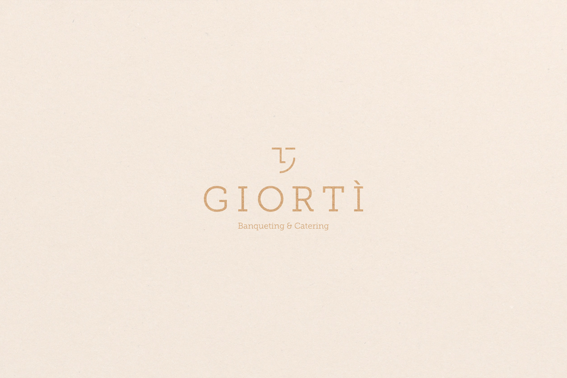
Giortì
-
The name of the company is Giortì which literally means "Banquet" in Greek, and also expresses the joy of sharing. He wants to be a name able to convey the strength of a lost tradition over the centuries, the tradition of sharing with food and rejoicing together. The company will combine innovation and refinement. Giortì is a simple name, "italianized" to have a greater impact on the mind of the customer. The style is elegant, sophisticated, pure and transmits a sense of high quality of the product.
—
Scope:
Logo Design and Branding, Print Materials.
—
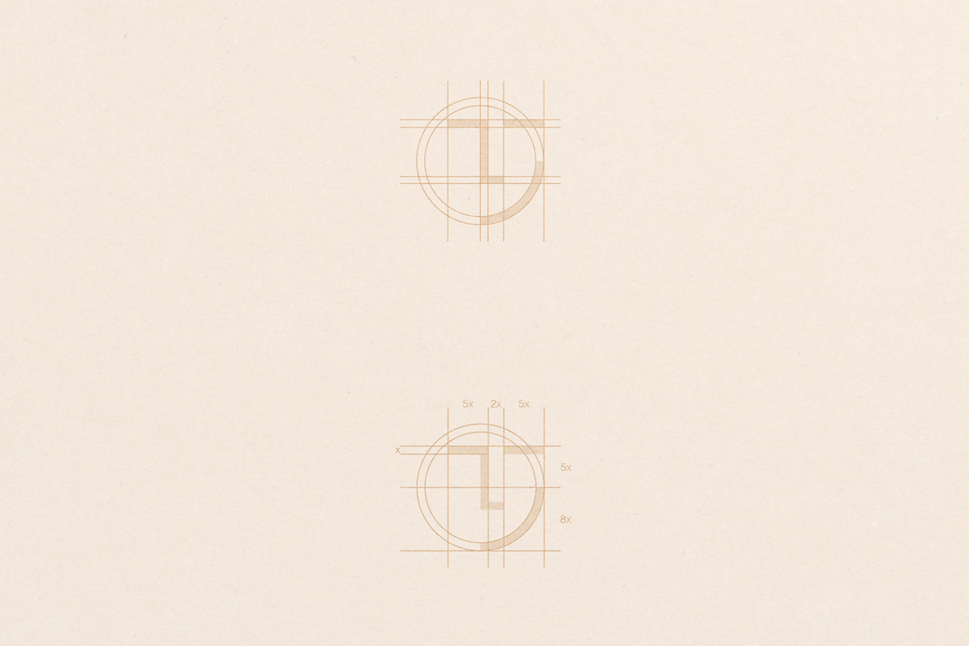
Logo Design
From the study of Greek writing and its pronunciation, the logo has a minimalist style, recalling a smiling face.
The result is a simple and modern logo that can be viewed on any device. A simple and straightforward message is conveyed by the logo design: satisfaction.
The advantages of Giortì include knowing in advance that what you want will be delivered.
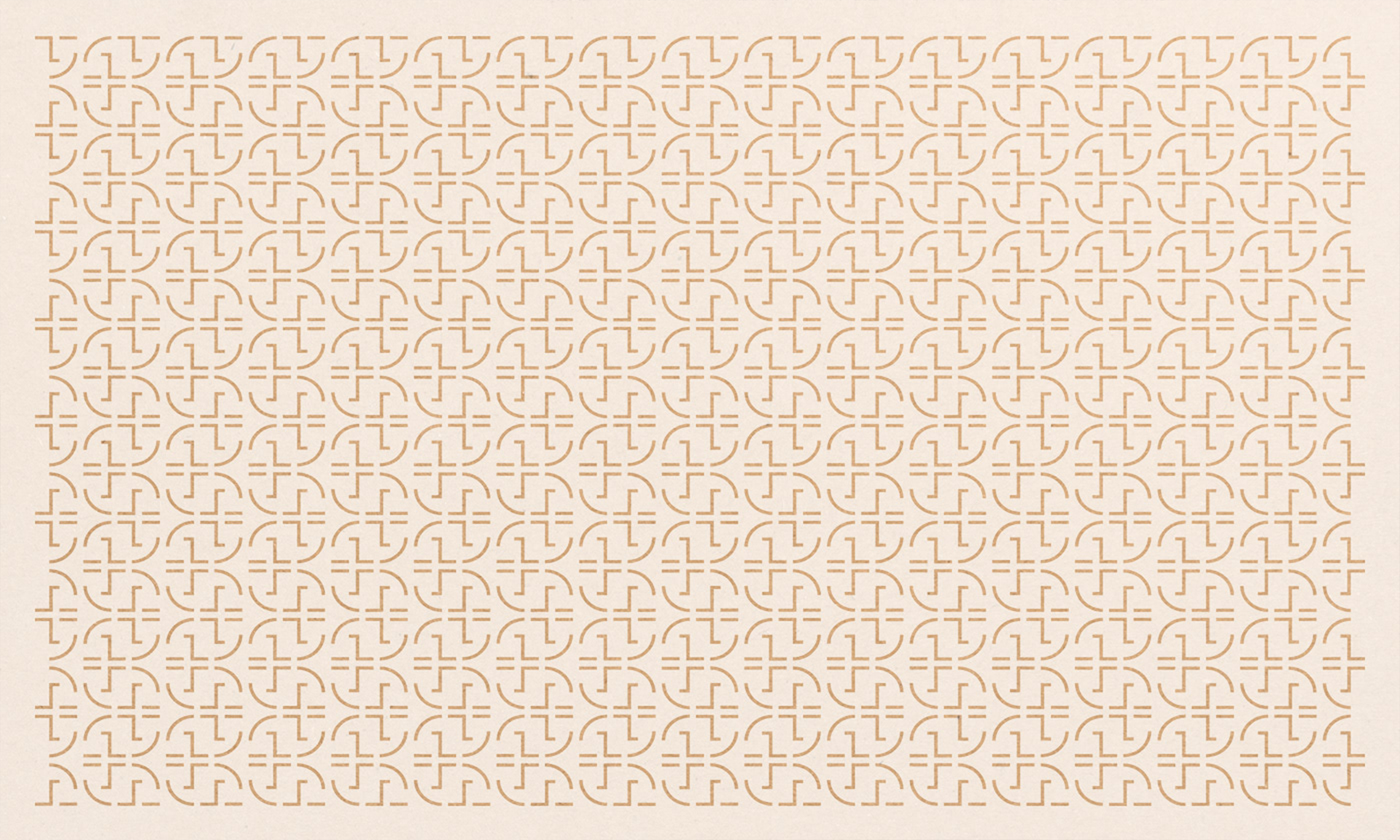
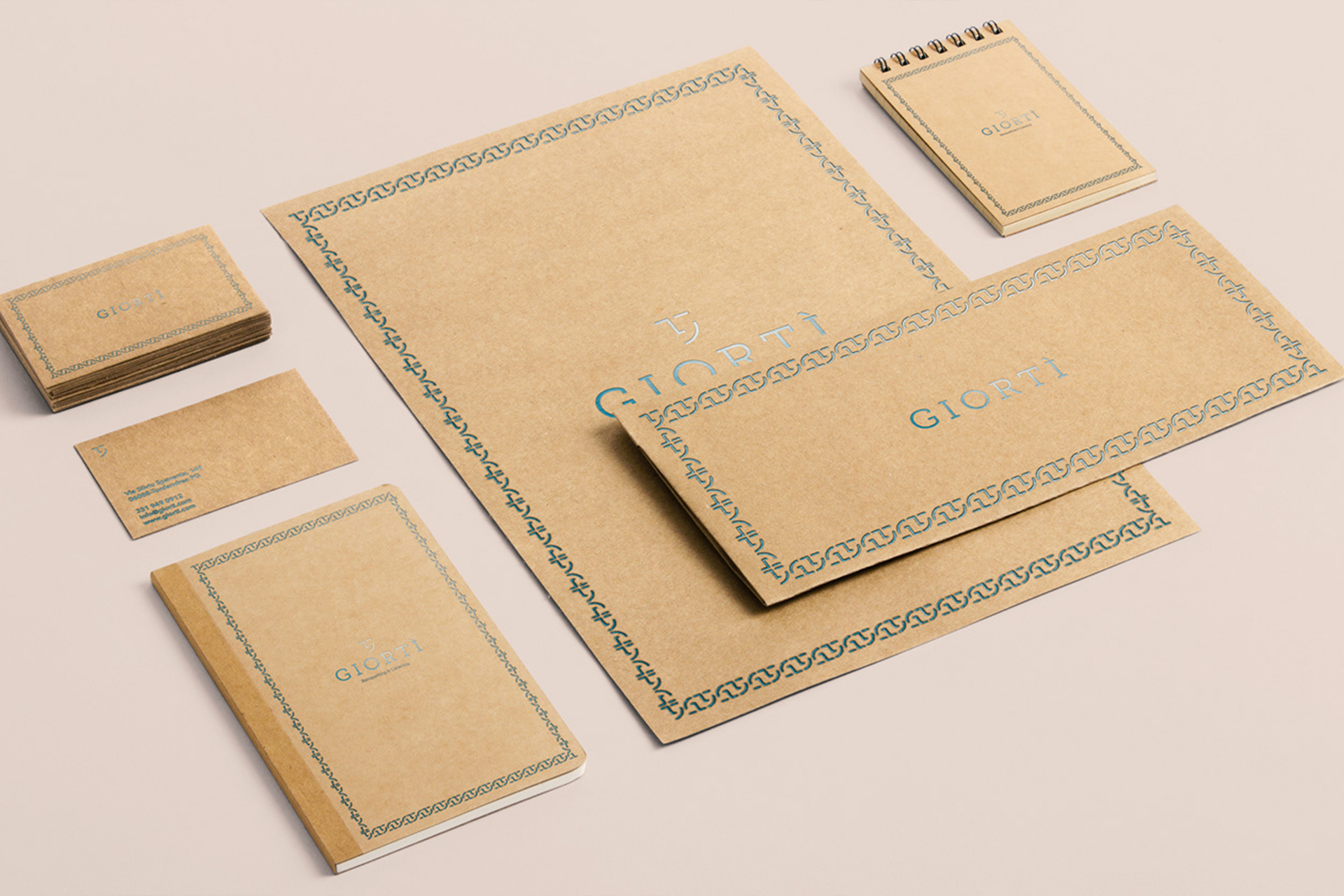
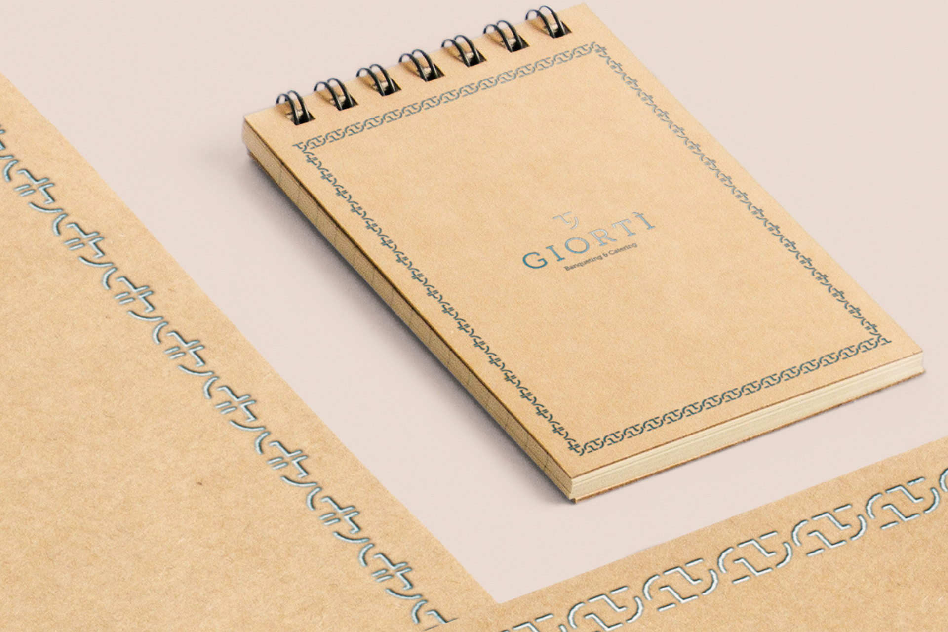
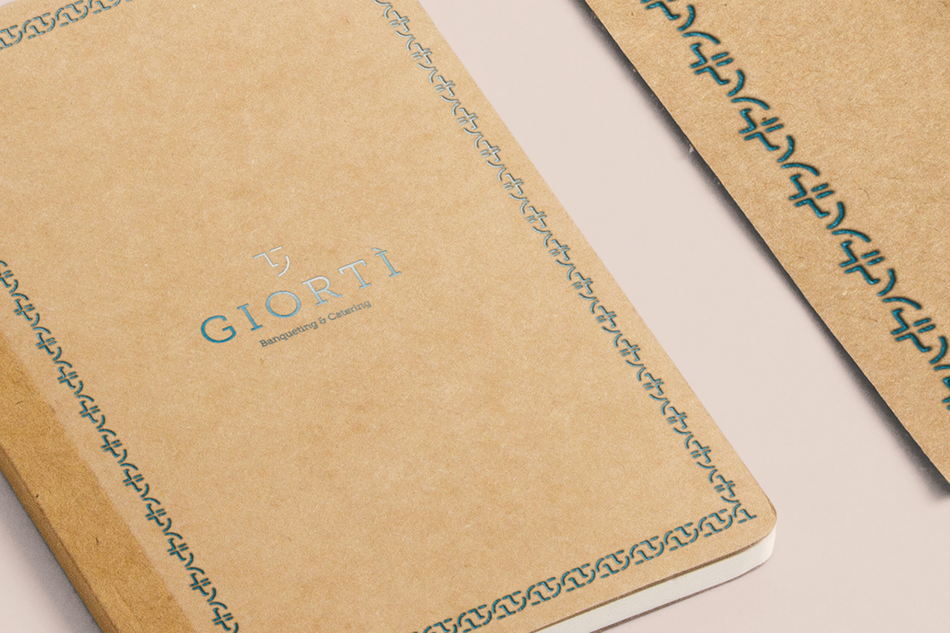
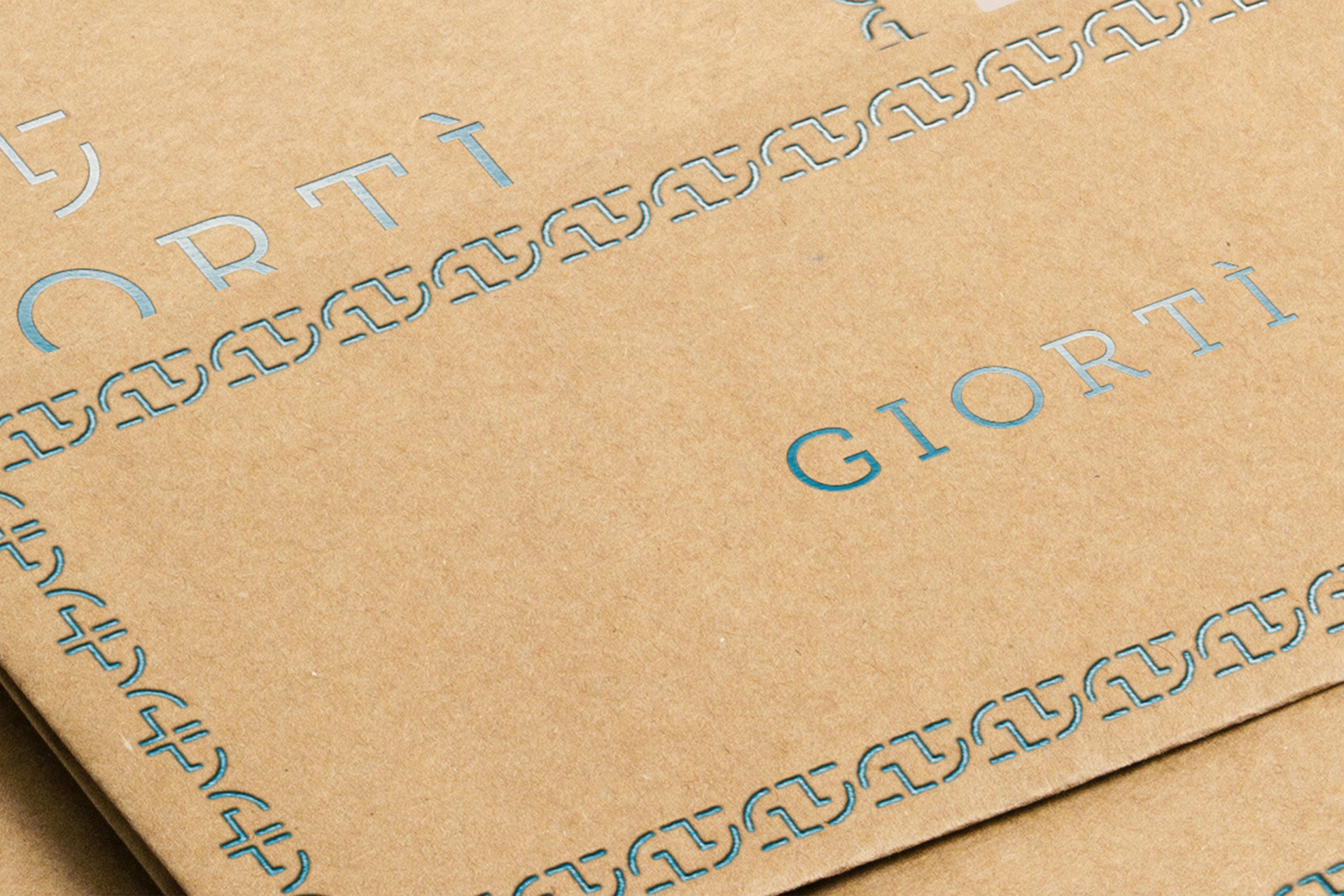
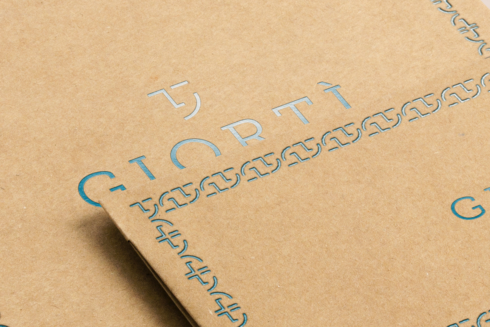
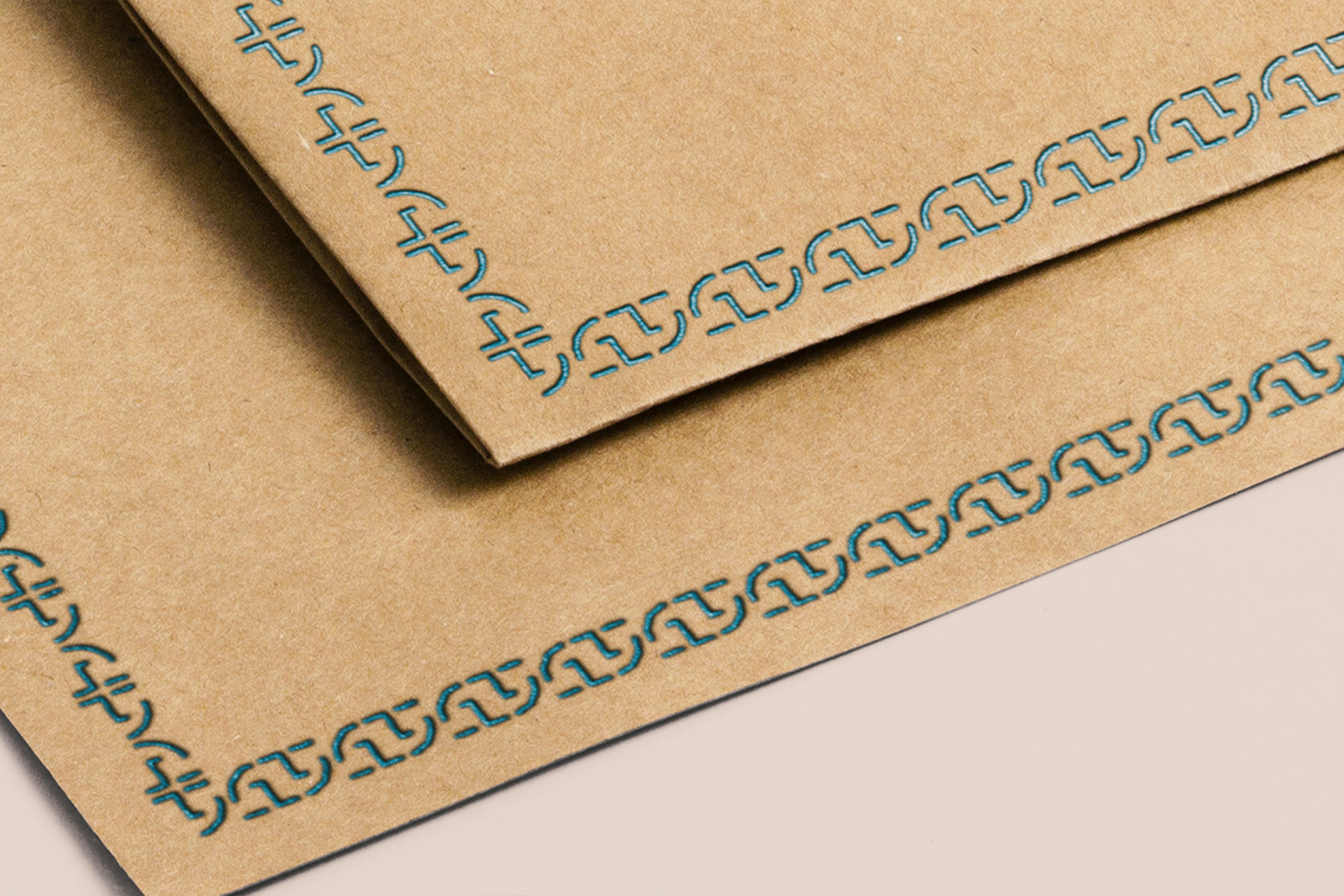
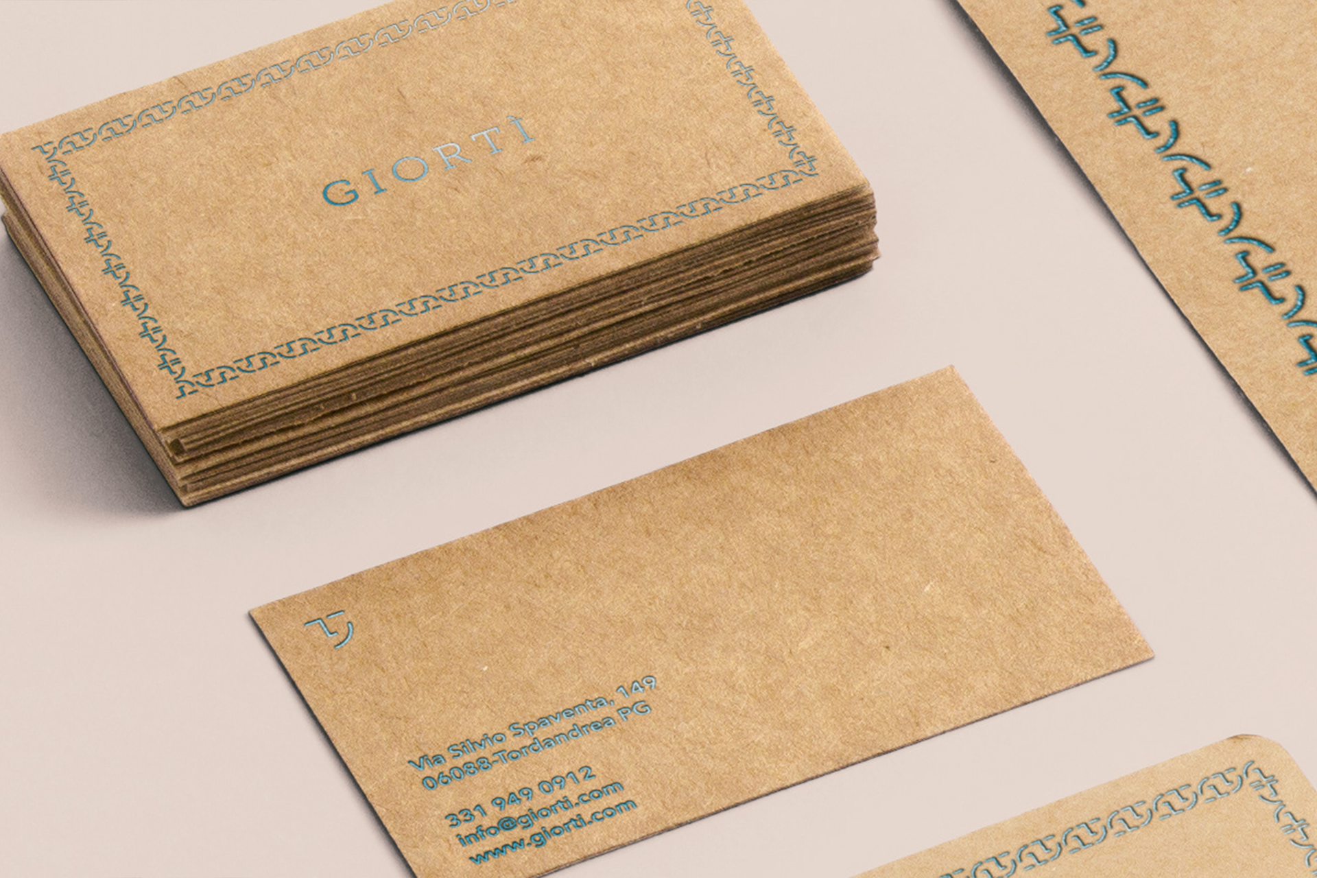
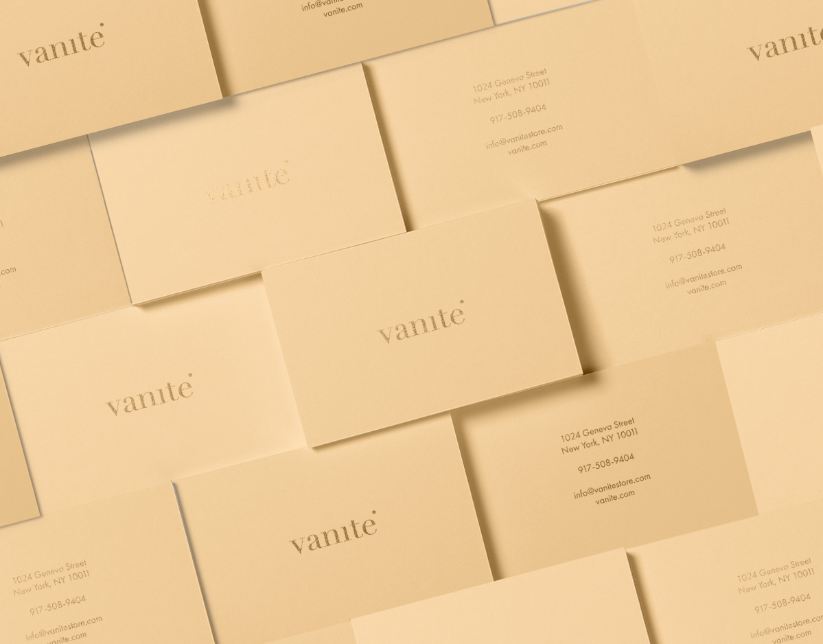
Corporate Identity
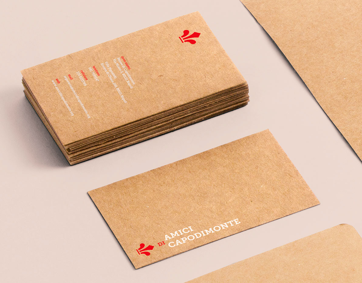
For the construction of the logo, I decided to use cardboard as a primary material, I think it can give a feeling of craftsmanship.
To conclude, I decided to use a foil print for all the details.
With this choice I think I was able to give the company what she was looking for a simple, elegant and easy-to-remember identity, an identity that communicates the company's professionalism and passion.